
Recognition
2017 AIGA Medal
Born
1954, Seattle, Washington
By Julie Lasky
September 4, 2017
Recognized for his intrepid exploration of subculture visual communication and his fearless celebration of cultural diversity.
Graphic design has never been a narcissist’s job. Ephemeral, anonymous, disposable, the work usually vanishes into the trash or ether. For Art Chantry, a designer rooted in the Pacific Northwest and a celebrated interpreter of old-fashioned commercial art, the purest graphic design bears the imprint of a community. Even if it lasts just a moment, it concentrates the essence of a place and time.
Chantry believes design is “the language of culture itself.” It flows like a stream from creator to creator, picking up bits of thinking and depositing others, eventually washing up on the shores of mainstream commercial practice. Now based in Tacoma, Washington, Chantry is known for his cultural posters and music packaging featuring old-style iconography and production techniques.
Arthur Samuel Wilbur Chantry II was born in Seattle on April 9, 1954, and raised in Tacoma. After restlessly attending a succession of three colleges, he earned a painting degree in 1978 from the school in Bellingham, Washington now known as Western Washington University. When he settled in Seattle, he encountered a boom in art galleries, regional theater companies, and rock bands. Crudely executed punk posters lined the streets, sparking a new creative energy.
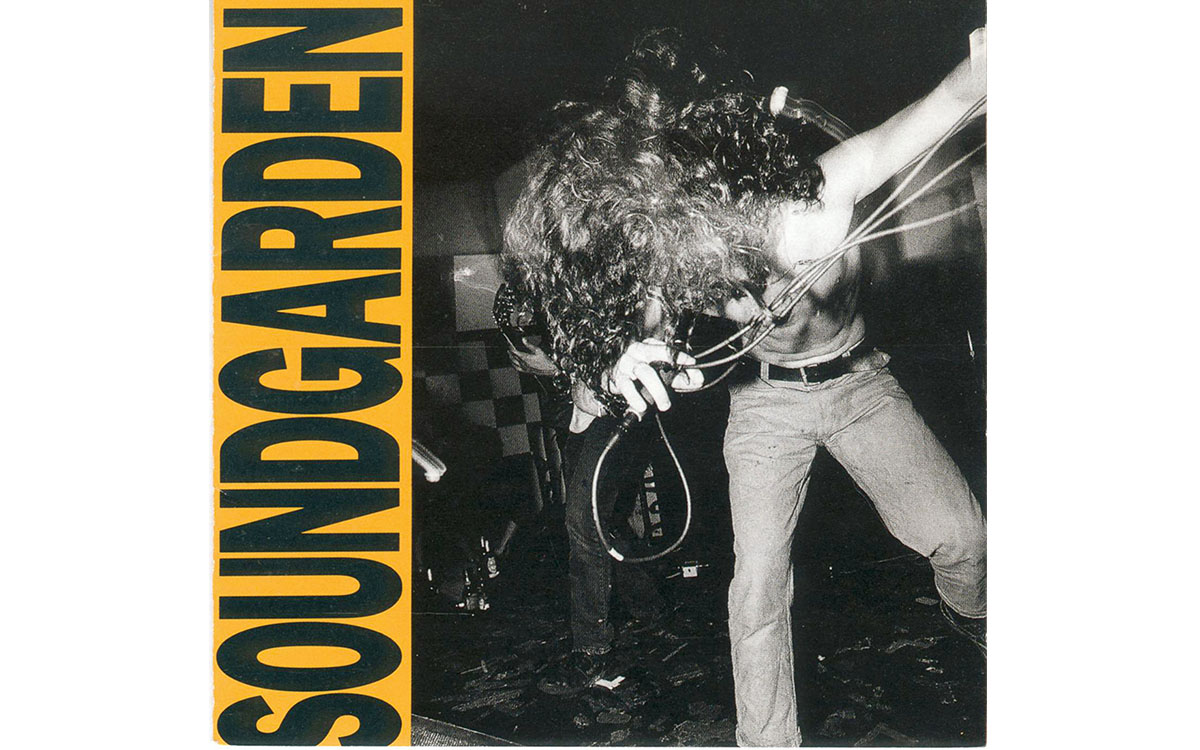
“Louder Than Love,” 1989: LP and CD cover for Soundgarden's first major-label release (on A&M; Records), and second studio album. Photographer: Charles Peterson.
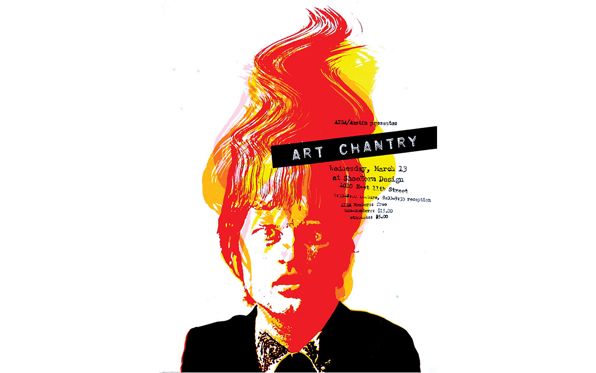
Art Chantry, 2004: Poster at AIGA Austin.
Photograph of Fred Ota, Tom Miller, John Weber, 1953. Thomas H. E. Miller Design Papers, Special Collections and Archives, University of Illinois at Chicago.
Working as a one-man design company, Chantry helped visually define Seattle’s cultural scene. His layered, textured graphics for plays, concerts, and festivals formed a bridge between the energetic designs of untrained artists and the smooth expressions of professional communicators.
In 1983 he began a relationship with The Rocket, a Seattle-based music biweekly publication that lasted a decade. Robert Newman, who was the magazine’s editor, recalls Chantry as “a brilliant visual storyteller. In the trenches as an editorial designer, he’s just masterful.” Most notoriously, Chantry rotated the publication’s logo a full 360 degrees over the course of six months. Newman remembers it as a smart and respectful way to engage readers.
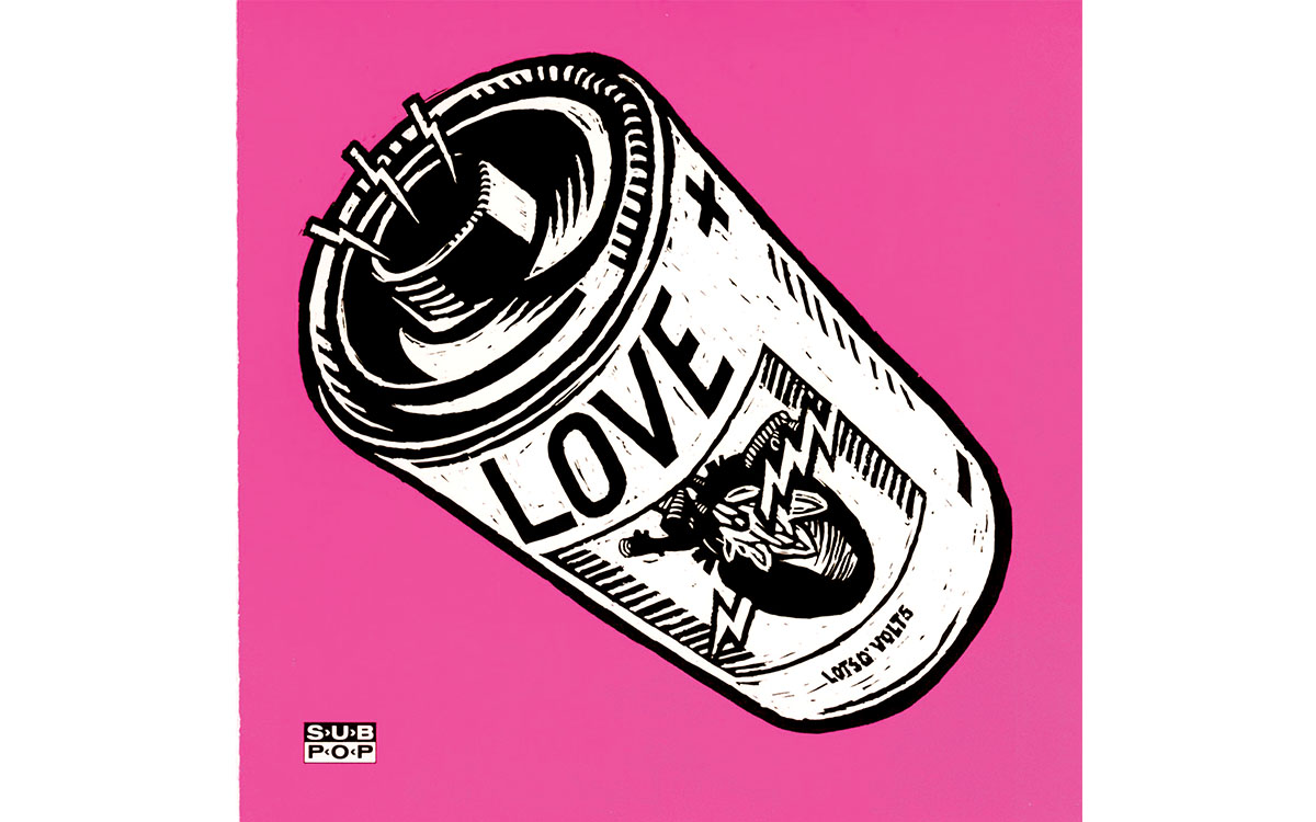
When grunge music emerged in the early 1990s, Chantry was in the thick of the scene, working with Sub Pop and other music labels associated with the movement. He mixed nostalgic references with slightly barbed irony and used his talent for composition to turn designs into ocular bull’s eyes—it was hard not to look.
At the turn of the millennium, Chantry found himself increasingly alienated from Seattle. He believed that the gritty city, which had been his muse as well as canvas, was losing its true self as it prospered. He moved to St. Louis for several years, but Washington State called him back, and he relocated to Tacoma, which he has always insisted is the unacknowledged cultural center of the galaxy.
In today’s digital climate, collaged retro imagery and rough textures often suggest authenticity. But Chantry pioneered this approach. He creates artwork with stencils, label makers, and multiple passes of imagery through photocopiers. He borrows the jagged hand-lettering of vintage science-fiction paperbacks and the split-fountain rainbows of ink on psychedelic posters. Long after computers brought polish and consistency to design production, he continues to celebrate the look of printers’ accidents—the splotches and registration failures that were common when people had to master unwieldy tools. For Chantry, it was this struggle that humanized design when it entered the industrial age, and revealed the printer as an unsung creative partner. “Whenever you see a bit of distressed typography, even if it’s a font premade to look distressed, you’re seeing the influence of his thinking,” says Jesse Reyes, a protégé who worked with Chantry on The Rocket and other Seattle design projects. “You see it on Ford truck ads on TV. You see it on microbrewery packaging, and that’s because Art has seeped that thinking into the mainstream.”
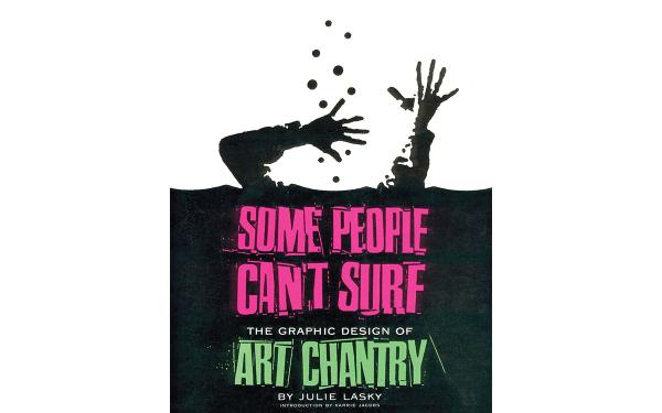
“Some People Can’t Surf,” 2001: Cover of “Some People Can’t Surf: The Graphic Design of Art Chantry,” a comprehensive look at Chantry’s creative evolution.
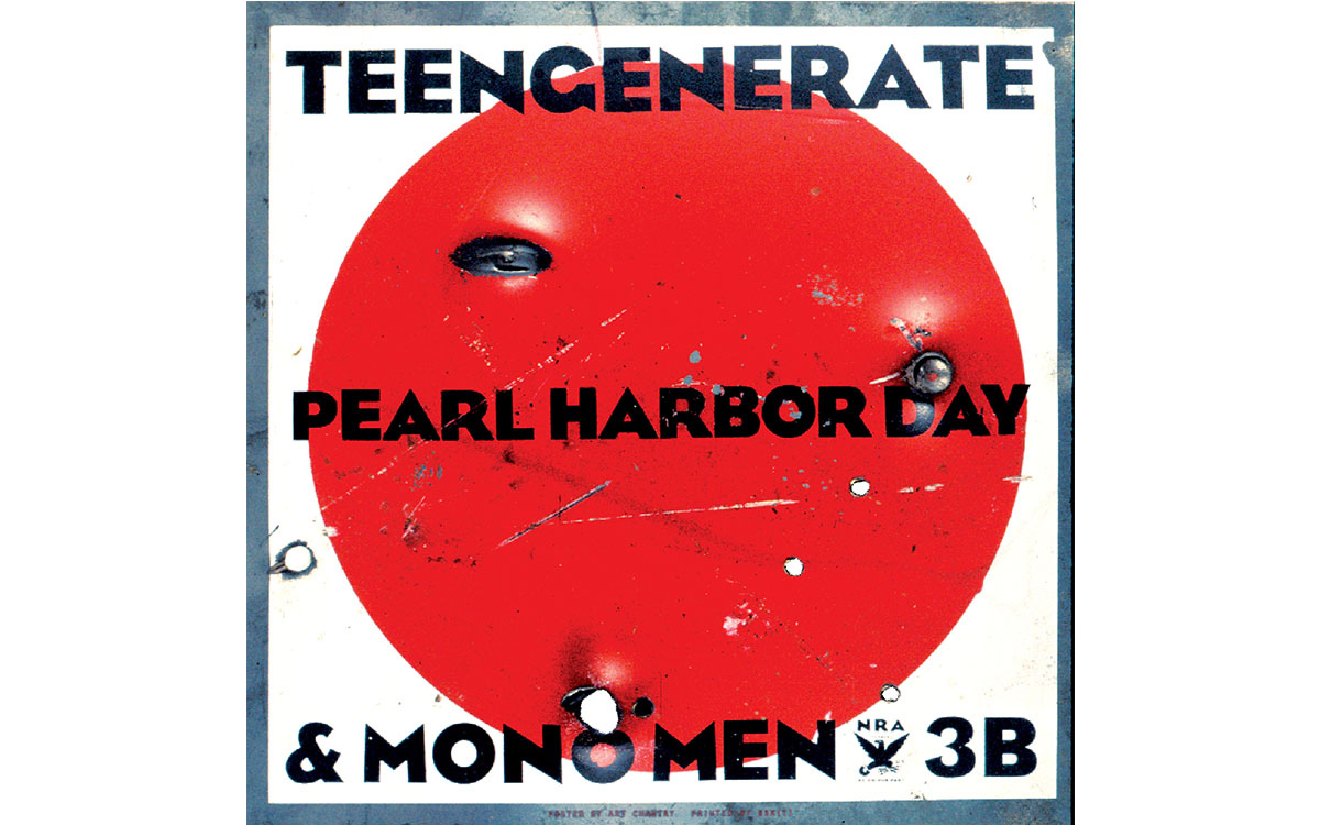
Teengenerate, 1995: A concert poster for Teengenerate, a Japanese punk band, depicting a metal sheet riddled with bullet holes.
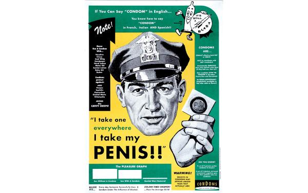
“Penis Cop,” 1997: Poster promoting condom use, which won a Bronze Lion award at the Cannes Lions International Festival of Creativity. Client: Cole and Weber.
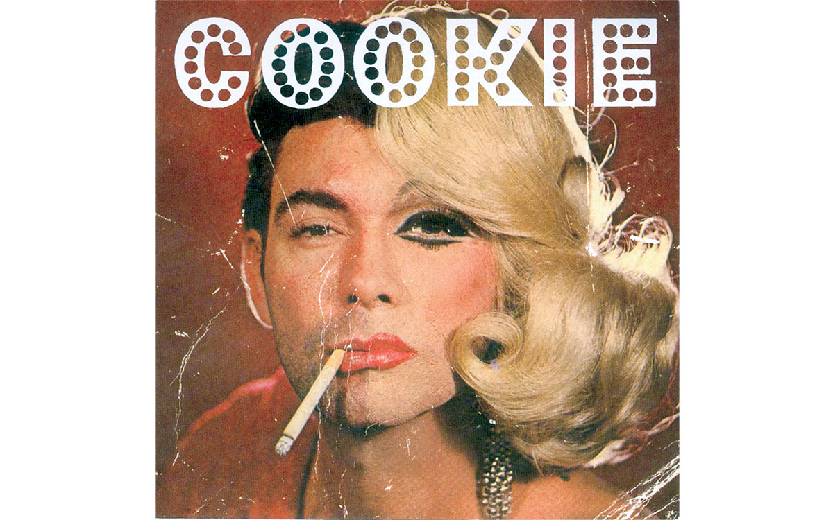
“Sweat Soaked & Satisfied,” 2002: Record cover for Cookie's album “Sweat Soaked and Satisfied” on Infect Records.
Charles Spencer Anderson, the Minneapolis designer who has similarly spent decades reinterpreting vintage graphics with a loving heart, says of Chantry, “He’s just one of the most genuine people in this business. He will sacrifice money, will sacrifice anything to do great work he believes in.”
“Art is in love with the actual process of making graphic design,” says Robert Newman. “He will do work that he does just so he can use the materials, or have the tactile experience.” Comparing Chantry to John Cassavetes and Jimi Hendrix, Newman points out that he is far more strategic than the spontaneous appearance of his design suggests. “Art took all the threads of graphic design from the ’30s and ’40s, and especially ’50s and ’60s, and gave it this modern approach that just tore your head off,” he says. “The influences are so deep and yet the way he speaks visually is so contemporary. My kids could look at it and think, ‘That’s cool.’ ”
Long dismissive of computers as design tools, Chantry has had to adjust to certain realities. Formerly he would create mechanicals, preparing artwork that emerged magically, or with happy mutations, on press. Now he designs comps that are scanned and passed on for digital production. But if he mourns the loss of outmoded technology, he also finds compensations. He is happy that the Internet has become a warehouse for design ephemera. Social media has allowed him to conduct regular online conversations with a large gang of enthusiasts. In 2015, Feral House published Art Chantry Speaks, a collection of his essays on design history that first appeared on Facebook. The shift to the digital world, he points out, “took the language of graphic design away from the elite academia—the world that defined what it was and what it was not—and put it into the hands of the every man.”
Recently Chantry was asked to design a label for a beer that had been brewed for a one-day museum promotion. He used an old black-and-white photograph of a handcuffed man smoking a cigarette while doing a perp walk. The brew’s name, he is pleased to note, was Art Chantry Imperial Bitter. Old-codger crabbiness is a cherished part of his persona, which was true even when he was young, but friends and colleagues say don’t be fooled. “He’d give the shirt off his back even if it was the last shirt he had,” Anderson remarks. “I can’t say that about many people.”
Sources
Chantry, Art. Chantry Speaks: A Heretic’s History of 20th Century Graphic Design. Port Townsend, Wash.: Feral House, 2015.
Lasky, Julie. “Art, Interrupted.” CityArts, May 2007.
Lasky, Julie. Some People Can’t Surf: The Graphic Design of Art Chantry. San Francisco: Chronicle Books, 2001.