2014 AIGA Medalist: Kenneth Carbone and Leslie Smolan
Recognition
2014 AIGA Medal
Born
1951, Philadelphia, Pennsylvania (Kenneth Carbone)
1952, New York, New York (Leslie Smolan)
By Angela Riechers
September 8, 2014
Recognized for demonstrating across decades the power of beautiful and well-reasoned design principles in corporate identity, communication, publishing and strategy to designers, business and the public.
Over the course of a design partnership spanning more than three decades, Kenneth Carbone and Leslie Smolan of Carbone Smolan Agency (CSA) have applied their nuanced, even artful approach to branding across all media for diverse clients, a roster that includes huge investment banks as well as tiny nonprofits, world famous cultural institutions, start-up fashion companies and five-star resorts. They are design generalists in the best sense of the term: Rather than aiming for an instantly recognizable signature style, they embrace a willingness to experiment and seek the unexpected. According to design critic Steven Heller, “Refinement and elegance are the armatures on which all of CSA’s projects are produced.”
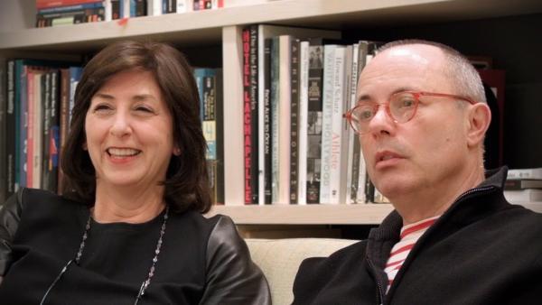
A fortuitous pairing of force and grace, Carbone and Smolan are rare birds: opposites who work in harmony. Carbone provides the initial broad stroke or energetic gesture that defines the visual essence of the project, while Smolan approaches from a content and strategy angle, carefully refining every aspect along the journey to completion. For Carbone, the creative process starts with images and then moves to words; as Smolan says, “Ken was born with a crayon in his hand.” He hosts life-drawing sessions at their studio and has filled 30 sketchbooks with thousands of pages of ideas, collages, notes and drawings. Smolan doesn’t draw at all; she prefers to define a project through words first, bringing a lyrical attention to detail and a keen eye for photography, both CSA hallmarks. Despite their very different angles of attack, their collaboration delivers seemingly effortless solutions to design problems, and their work is always witty, well thought-out and impactful.

Aether Jacket featuring logo, 2008 Client: Aether Apparel; Design firm: Carbone Smolan Agency.
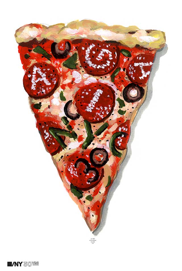
AIGA/NY 30th Anniversary Poster, 2012 Client: AIGA/NY; Design firm: Carbone Smolan Agency.
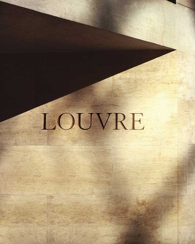
Musée du Louvre signage, 1988 Client: Musée du Louvre; Design firm: Carbone Smolan Agency.
Coincidentally, both Carbone and Smolan attended the design program at the Philadelphia College of Art (now the University of the Arts) during the early 1970s—but their paths never crossed there. By the time Carbone turned 25, he had already worked for legendary designers Ivan Chermayeff and Tom Geismar and was running a New York City satellite office for Canadian firm Gottschalk+Ash. He hired Smolan in 1977 on the recommendation of a mutual former teacher, and three years later they acquired the studio through a leveraged buyout and later changed its name to Carbone Smolan Agency.
In 1985 they received a fateful telegram requesting their participation in a competition to redesign the signage for the Louvre, and ended up winning the commission—a huge honor for a relatively young studio. The effectiveness of their now-iconic signage lies in the clean, uncluttered wayfinding: Main display panels are in French only, with galleries and locations numerically keyed to guides available in many languages. The project’s success and high visibility helped establish CSA as a studio of major importance in the larger design landscape.
As their business grew over the coming decades, they continued to approach each project as a set of multiple components interlinked across all media—a routine requirement now, but innovative for its time. In 1999, their global brand identity for Christie’s auction house started with an overhaul of the 250-year-old portrait of the founder James Christie for use on auction invitations and packaging, and finished up with a 100-foot-long window display system at the Rockefeller Center headquarters. A few years later, in 2005, their logo design, communications program and website for the Brooklyn Botanic Garden repositioned the identity of this venerable institution, from its online presence to its informational brochures, as a New York destination that attracted thousands of new visitors.
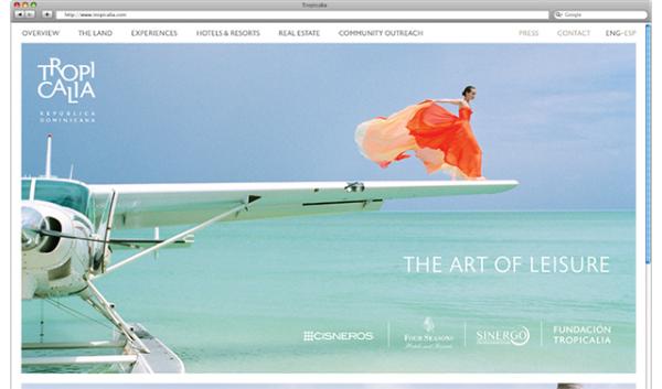
Tropicalia website, 2013 Client: Cisneros Group of Companies; Design firm: Carbone Smolan Agency; Photographer: Rodney Smith.

Mandarin Oriental Hotel Group global website, 2012 Client: Mandarin Oriental Hotel Group; Design firm: Carbone Smolan Agency.

Greenmarket Co. brand identity truck applications, 2012 Client: GrowNYC; Design firm: Carbone Smolan Agency.
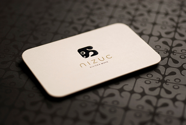
Nizuc Resort & Spa, 2007 Client: Alan Becker; Design firm: Carbone Smolan Agency.
CSA’s 2007 identity for the Nizuc Resort in Cancún, Mexico, reflects Smolan’s love of conceptual depth and detail, as well as her decisive use of photographic imagery. Using the history of the Maya as a main piece of the brand narrative, CSA designed a modern-looking Mayan glyph and incorporated it into the resort’s identity and collateral including amulets, cookies, tote bags and sarongs that were photographed on-site, some with models, in lavish shoots directed by Smolan. The embedded story beautifully integrates the resort’s branding with the surrounding Yucatán landscape.
The studio’s longstanding relationship with investment banking giant Morgan Stanley—twelve years to date—has managed to outlast the tenure of three of its CEOs and two recessions. It’s a very different world than the art, hospitality, luxury or real estate categories CSA has cultivated in their diverse portfolio, yet Smolan notes, “I really like designing for financial services because it’s hard for people to understand what it is they’re buying and why they should buy it, and so I constantly keep trying to make the message simpler and clearer.” Often this means including visual cues that preserve an emotional connection already associated with the brand. The Morgan Stanley identity, overhauled in 2005, featured a new logo pattern designed to suggest the motion of stock tickers, referencing the past in an instantly recognizable way that works on all scales, from outdoor signage to a debit card.
Carbone and Smolan’s complementary yet opposing personalities were neatly summed up in a recent conversation about their decades-long partnership at CSA, which now has a staff of more than 30 people. Carbone mentioned that because he doesn’t have Smolan’s reserves of patience, if a client insists on a direction that he disagrees with and can’t be convinced otherwise, then that’s the solution that particular client deserves. Smolan gently resisted. “I won’t do that!” she countered. “I can’t let them hang themselves. I wait them out by being stubborn and calm, patiently chipping away until they finally see my point of view. I lead them where they need to go, whether they want to go there or not.”