Recognition
2011 AIGA Medal
Born
1920, Winterthur, Switzerland
Deceased
December 18, 2020
By Rick Poynor
September 25, 2011
Legendary Swiss graphic designer and educator, Armin Hofmann is recognized for his immeasurable influence on generations of designers, teaching the power and elegance of simplicity and clarity through a timeless aesthetic, always informed by context.
If the passionate loyalty of former students is any indication, Armin Hofmann is one of the most exceptionally influential teachers the field of graphic design has seen. He is also a designer of great accomplishment, a leading member of a remarkable generation of Swiss practitioners whose work and thinking continues to have a determining effect on the international understanding of graphic design. There is, however, nothing doctrinaire or circumscribed about Hofmann’s Swissness. His insights and practice transcend any sense of nationality or “school” and attain a level that many of those who experienced the challenge of studying under his tutelage would regard as elemental. A significant number of those students—among them Kenneth Hiebert, April Greiman, Robert Probst, Steff Geissbuhler, Hans-Ulrich Allemann, Inge Druckrey and the late Dan Friedman—went on to become leading designers and educators themselves.
For Hiebert, author of Graphic Design Sources, who studied in Hofmann’s graphic design class in Basel from 1960 to 1964, he is “a person that radically changed me and my life.” “Wait till you get into Hofmann’s class . . . it’ll be like starting all over again,” a foundation course teacher warned him. “So it was,” Hiebert writes in Armin Hofmann: His Work, Quest and Philosophy, “because Armin Hofmann didn’t let you merely utilize what you already knew. You had to strip that away, too, to immerse yourself into a new problem.” Only at the end of this prolonged rite of passage, Hiebert recalls, after everything superficial had been stripped away, would the student arrive at a piece of work that was legitimately subjective.
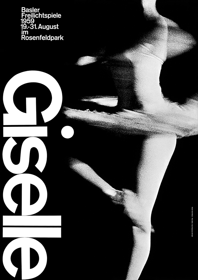
"Giselle, Basler Freilichtspiele," photolithograph, 1959. Designer: Armin Hofmann; Printer: Wassermann A.G., Basel.
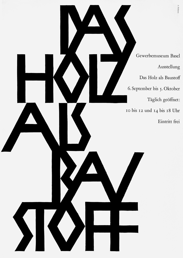
"Das Holz als Bau Stoff" linocut, 1952. Designer: Armin Hofmann.
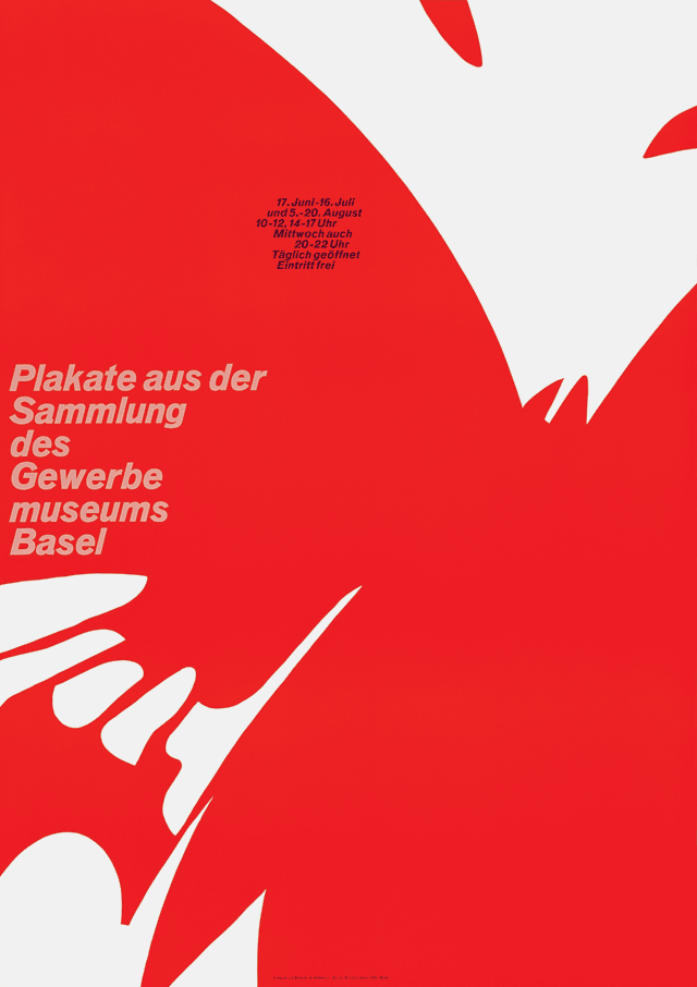
"Plakate aus der Sammlung des Gewerbe museums Basel," linocut,1964. Designer: Armin Hofmann; Printer: Buchdruckerei VSK, Basel..
The memories of Hofmann’s students evoke a powerful sense of his presence in the classroom. Everyone remembers him as a teacher of few words. “His charisma and energy were balanced with patience,” says Jerry Kuyper, who studied in Hofmann’s advanced class. “He believed in the individual’s ability to discover and create, which enabled him to often just stand back and watch.” Hiebert describes his “incessant roving, questioning, thinking-ahead eyes.” For Hofmann, the process of discovery was vital, however long it might take. He never imposed artificial deadlines; a project was only finished when the student had arrived at a satisfactory resolution. In this atmosphere, the smallest direction, a hand gesture to suggest a line of visual development, could prove decisive. “Sometimes it was simply a touch on the shoulder and him saying, ‘Ja, ja, just keep going.’ This little encouragement would do wonders and give the necessary confidence to go on,” says Allemann, a student from 1960 to 1965.
Greiman recalls time spent with Hofmann and his wife, Dorothea, at their home in Ticino in the summer of 1971, after studying in Basel. His manner was friendlier and more relaxed there. “He had abundant energy and liked to do very physical things like digging holes. He often made jokes. He had a charming playful side to him. Sometimes he would make Dorothea and I laugh very hard.” Near the end of Greiman’s stay, she received telegrams from Hiebert with information about her new teaching post at Philadelphia College of Art—she hadn’t applied. Hofmann confirmed the news. “There is no more I can teach you,” he told her. “You just have to get out there and start doing it.” So, at 23, feeling like she had been thrown out of the nest, she followed her instructor’s wishes and headed for Philadelphia.
Hofmann was born in Winterthur, Switzerland, in 1920. After studying at the School of Arts and Crafts in Zurich, he worked as a lithographer in Basel and Bern, and opened a studio in Basel. In 1947, he began teaching at the Basel School of Arts and Crafts after meeting Emil Ruder on a train and learning that the school was looking for a teacher. Hofmann would remain there for 40 years. In 1968, he initiated the advanced class for graphic design, and in 1973 he became head of the graphic design department. He first taught in the United States at Philadelphia College of Art in 1955, and shortly after began teaching at Yale University, where he played a key role until his resignation in 1991. In 1965, he published Graphic Design Manual, a distillation of the essential principles of his rational approach to teaching design. Nearly half a century later, the revised edition of this pedagogical classic is still in print.
Hofmann saw his designs, in part, as didactic demonstrations of these principles. The posters he created in the late 1950s and 1960s for cultural clients such as the Kunsthalle Basel and the Stadttheater Basel possess great typographic and photographic purity of form. In a theater poster, he interprets the dramatic experience of watching and listening with mesmerizingly large and grainy photos of an ear and eye, amplifying the impact by reducing the visual idea to its essential components. Another design assembles a formally perfect arrangement of fragments: column, music stand, section of cello, ballerina’s pointing foot, riding boot with spur. In Hofmann’s 1959 poster for the ballet Giselle, the stark white typographic tower of the title—note the intermediary dot of the “i”—holds the blurring halftone of the dancer’s pirouette in a state of dynamic balance and grace. A promotional poster for Herman Miller titled “Furniture of our Times” becomes a visual meditation on shapes for sitting on, visualized as a collection of near-abstract silhouettes.
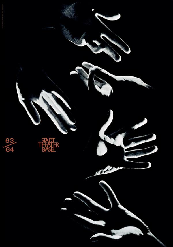
"Stadt Theater Basel" offset lithograph,1963. Designer: Armin Hofmann.
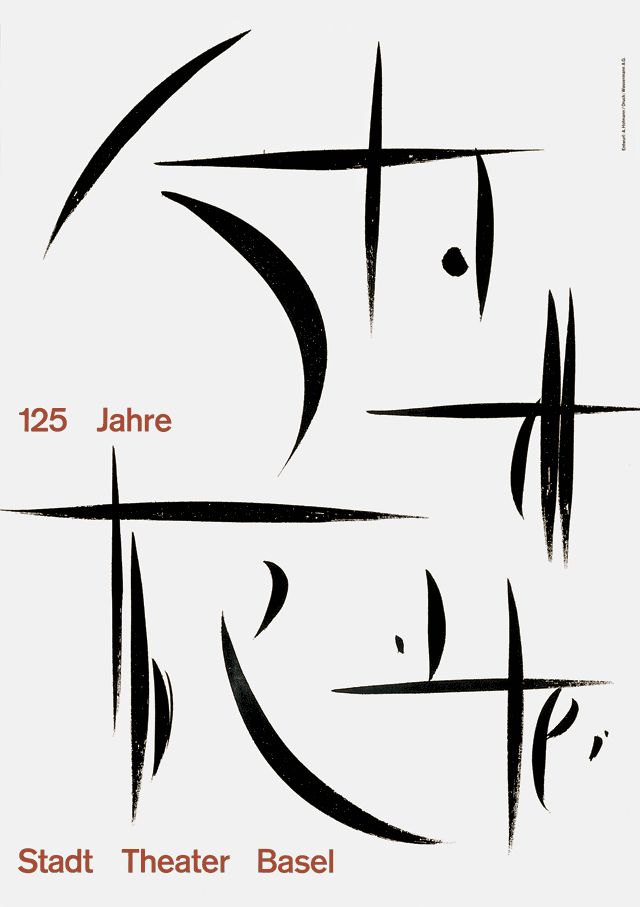
"Stadt Theater Basel," poster. Designer: Armin Hofmann.
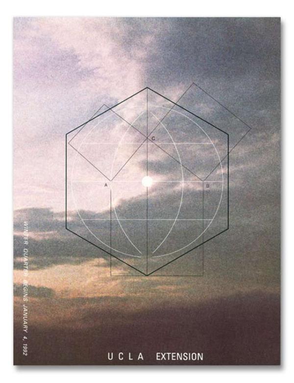
"UCLA Extension Winter Quarter" poster, 1991. Designer: Armin Hofmann; Art director: Inju Sturgeon.
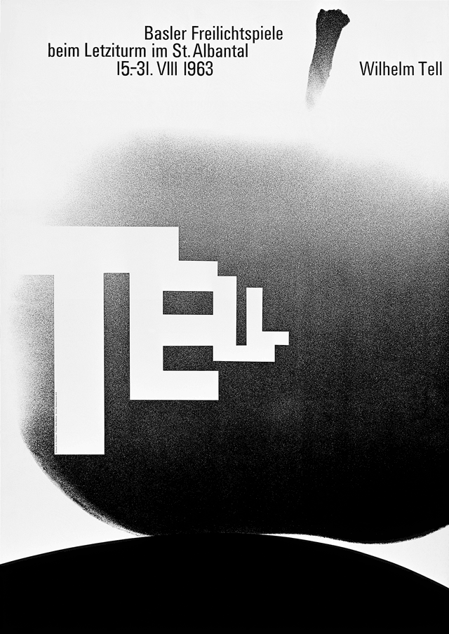
"Tell," poster, 1963. Designer: Armin Hofmann.
“In its purity of form and purposeful expression, Hofmann’s work is uniquely personal,” says Allemann. “It also has soul.” For Robert and Alison Probst, who was also Hofmann’s student, these enduring designs are the work of “a master of his craft with a superior sense of aesthetics. His work deals with the universal language of signs and symbols, often including serendipity and always aiming for timeless beauty.”
It is easy today to underestimate the impression that these posters made in the streets. Hofmann’s sparing use of black and white had an argumentative and even ethical purpose. In the early days of the post-war consumer society, his work proposed (we might now think over-optimistically) a visual culture founded on an ideal of thoughtful restraint. “I have endeavored to do something to counteract the increasing trivialization of color evident since the Second World War on billboards, in modern utensils and in the entertainment industry,” he writes. “I tried to create a kind of counterpicture.” The coming of color TV only strengthened his resolve; all the “musicality” of color was lost. To generate expressive energy in a design, he would use color only in carefully determined patches within a neutral area. “I feel that a sensible and meaningful form of advertising can be achieved by simplification of the formal language and by restraint in the treatment of the verbal message,” he writes. “I was not prompted by advertising considerations in my work but rather by a feeling of regret that an important economic instrument should have begun to affect the cultural life of society so adversely.”
To appreciate fully what Hofmann achieved—what he stood for—we need to remember that his dedication to visual resolution represented a larger vision of civilized society. He belongs to a generation that sought to find a new visual language that would be appropriate for a complex technological world. “What few people have realised about Hofmann is that behind the artistic beauty of his design was a strong conviction about cultural, moral and social issues,” said Friedman in 1994. “He has high morals and a strong regard for environmental and social justice,” notes Probst, now dean of the College of Design, Architecture, Art, and Planning at the University of Cincinnati. Allemann points out that Hofmann did not participate in the exploitation of Swiss Style by the corporate world. “He could foresee that what began as a utopian theory would turn into a style. This was something he was not interested in. Time has proven that he was right.”
While Hofmann’s posters are widely celebrated, there are aspects of his work that deserve, even now, to be better known. He was an artist as well as a designer, with a strong sense of structure and space; he created wall reliefs, glass paintings, floor tiles and mosaics, acoustic walls, and other sculptural pieces. In all of these art works, as with his students’ projects, he sought a kind of musical resonance, to which he gave the German word Klang. Hiebert describes this quality as the “convergence of visual logic and perceptual vitality.” “Es muess klinge—it has to be sonorous—was one of his famous sayings,” recalls Allemann.
What comes across, again and again, in the tales of those who studied with Hofmann is the generous spirit of a man who, by trying to express what he had to say as simply as possible, incised a deep and lasting impression. “I owe everything I know about design to Hofmann,” says Steff Geissbuhler. “He shaped me as a designer and a person.” Inge Druckrey remembers how Hofmann would take his students on field trips to see ceiling paintings in an early Romanesque church, modern architecture at Ronchamp, or the colored boats and beautiful light of an Italian fishing village on the way to Venice. “There was no lengthy commentary,” she says, “only the expression sauschoen, which meant ‘just look at it, this work is terrific.’” The same could just as readily be said of Hofmann’s designs. Only by looking hard will we be able to see.