
Recognized for her eloquent editorial and entertainment design, setting a new standard of emotional and visual connection.
During the early part of her career Gail Anderson was seen but not much heard, which doesn't mean she wasn't outspoken. In fact, typographically speaking she was incredibly eloquent. At Rolling Stone magazine, where she held numerous positions from 1987–2002, starting as an associate and becoming senior art director, Anderson lent her flair to much of the conceptual typography that defined the magazine's feature pages. She appreciably contributed to the widespread eclectic typographic fashion that prevailed throughout the 1990s but never fell into a style trap. For much of her tenure at Rolling Stone, working with art director (and AIGA Medalist) Fred Woodward, she fine-tuned her typographic expressionism in a cramped office filled floor to ceiling with all kinds of stimulating scraps, devising quirky letterforms out of traditional and untraditional materials, from hot metal and wood type to twigs and bottle caps. From this typographic wellspring came an ever-expanding vocabulary of signs and symbols, methods and mannerisms that, in turn, influenced a slew of designers who followed (and at times copied) her graphic eccentricities. After Rolling Stone she joined SpotCo, one of the largest entertainment design agencies in New York, where she is now creative director of design, and for half a dozen years her poster designs for scores of Broadway and off-Broadway plays have illuminated bus shelters, subway stations and billboards.
A lifelong New Yorker, Anderson embodies three virtues: inspiring art director, inspired designer and inspirational teacher. Despite being deceptively low key, she does everything with intense passion. Her extreme devotion to craft (she often frets for ages over the minutest typographic detail) combined with an unceasing, though always natural, pursuit of whimsy distinguishes her brand of quirkiness from the larger pack of knee-jerk quirks. While some might choose to call her method retro, the work defies stylistic pigeonholing. She revels in making typography from old and new forms, which is neither modernist nor post-modernist, but rather spot-on contemporaneous. During the early digital '90s when typography was alternately under- and over-adorned, Anderson exacted the right balance with compositions that were elegant yet muscular, and, more importantly, surprising and delightful. “Her significant contribution to design,” says Drew Hodges, her former classmate and current employer as founder and president of SpotCo, “is a belief in the tradition of typography and a joy in using it in a contemporary vernacular.”
Anderson developed her approach while studying at the School of Visual Arts in New York under Paula Scher. But growing up, she recalls, “I used to make little Jackson Five and Partridge Family magazines. I wondered who designed Spec, 16 and Tiger Beat in real life, and as I got older, I began to research what was then called 'commercial art.'”
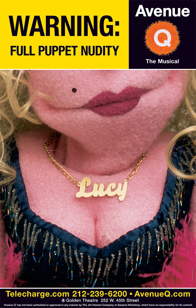
SpotCo Broadway theater poster for Avenue Q, 2003 (Designer: Gail Anderson; Client: The Producing Office).
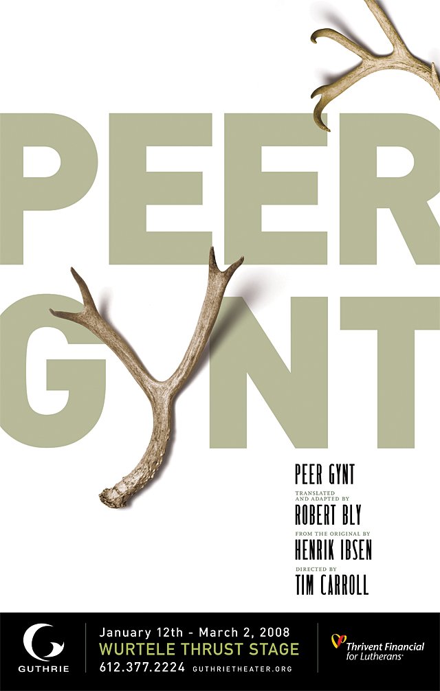
SpotCo Guthrie Theater poster for Peer Gynt, 2007 (Art director: Gail Anderson; Designers: Gail Anderson and Esther Wu; Client: The Guthrie Theater).
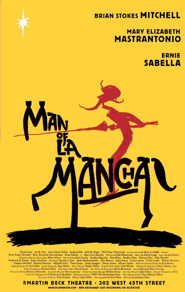
SpotCo Broadway theater poster for Man of La Mancha, 2002 (Designer: Gail Anderson; Illustrators: Ward Schumaker and James Victore; Client: David Stone).
Anderson's first job post-college was a brief stint at Vintage Books in 1984, followed by two years at The Boston Globe Sunday Magazine, from 1985–1987. Under art director Ronn Campisi, the Globe was at the vanguard of new newspaper design. She worked on the magazine with Lynn Staley and Lucy Bartholomay. Meanwhile, Campisi was an early proponent of typographic eclecticism, which stirred together Victorian, Deco and Futurist typographies in a contemporary stew.
Working with Woodward at Rolling Stone was a hand-in-glove experience—they knew each other about as well as two people could. “Music always set the tone, and he was into low lighting, so the design room felt sort of cozy,” Anderson recalls. “And he'd just howl with glee when we 'got it' and it was a winner. He could really get you jazzed about the process, even when it was difficult.” Anderson's own typographic proclivities were ultimately well suited to Rolling Stone, where she designed what might best be called “theatrical typography.”
Like actors on a stage Anderson directed letterforms to perform dramatic and comic feats. In just two dimensions they emoted, expressed and exuded energy that projected them off the page. It is no surprise that the class she now teaches in the School of Visual Arts' MFA Designer as Author program is about choreographing typefaces, making them dance to the beats and rhythms of popular and alternative music.
Anderson has a special gift for assigning illustration and has been a stalwart advocate of illustrators, both upcoming and established. “With her keen eye for fresh talent, she nurtured a whole generation of illustrators, while staying loyal to the greats as well,” says Woodward.
The most difficult time in her career came in 2002, after her move to SpotCo, when negotiating the transition from editorial design to advertising. “You approach each project searching for a dozen great ideas, not just one or two,” Anderson explains of how her work competes for the attention (and dollars) of theatergoers. “After about seven designs, you realize there really are infinite ways to look at a problem. I now completely enjoy the process, though I'm keenly aware that all but one of those dozen great ideas will eventually be killed. It's strangely liberating.”
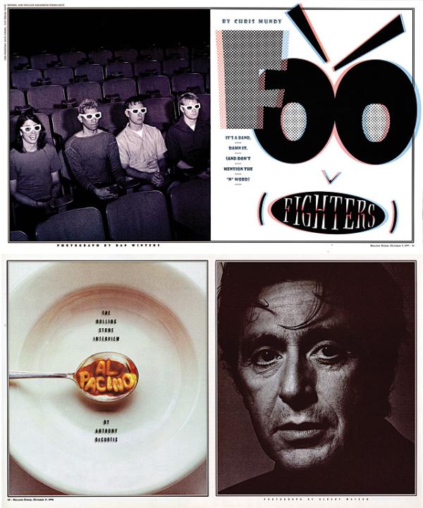
Rolling Stone magazine spreads (from top): Foo Fighters, 1995 (Art director: Fred Woodward; Designer: Gail Anderson; Photographer: Dan Winters); Al Pacino, 1996 (Art director: Fred Woodward; Designer: Gail Anderson; Photographer: Albert Watson).
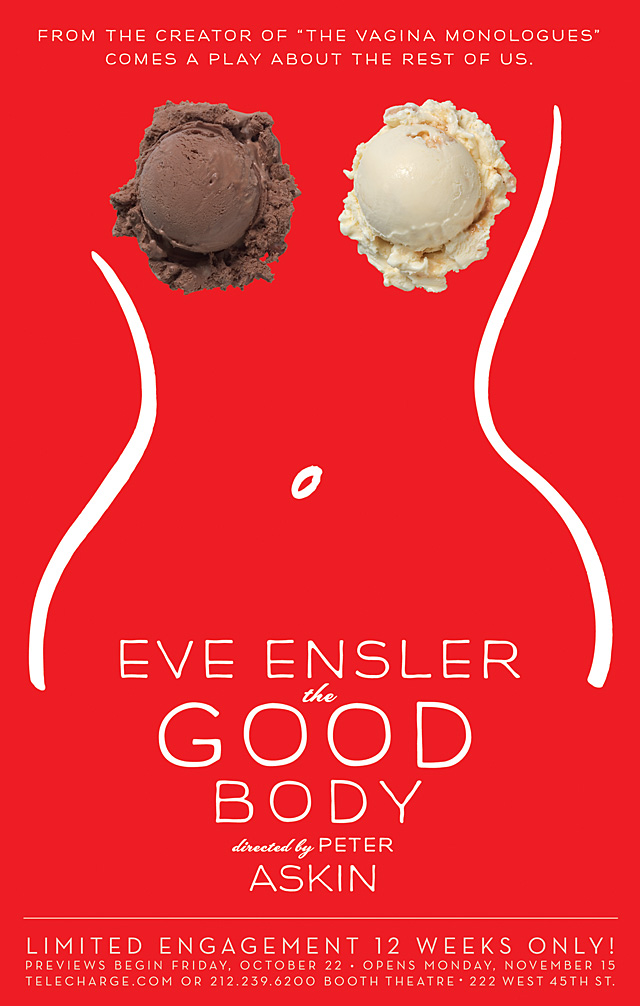
SpotCo Broadway theater poster for The Good Body, 2004 (Art director: Gail Anderson; Designer: Gail Anderson; Illustrator: Isabelle Dervaux; Clients: Harriet Newman Leve, The Araca Group, East of Eden in association with the American Conservatory Theater).
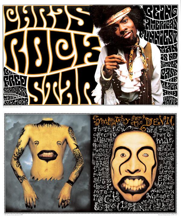
Rolling Stone magazine spreads (from top): Chris Rock, 1997 (Art director: Fred Woodward; Designer: Gail Anderson; Photographer: Mark Seliger); Marilyn Manson, 1997 (Art director: Fred Woodward; Designers: Fred Woodward and Gail Anderson; Photographer: Matt Mahurin).
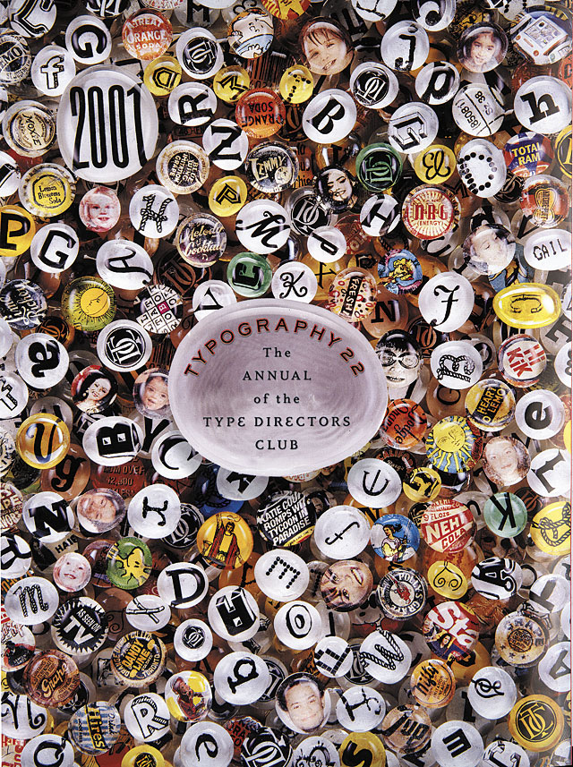
Type Directors Club annual, 2001 (Designer: Gail Anderson).
Always looking for that little visual wink or tiny gesture of extra care, Anderson says, “I'm all about the wood-type bits and pieces. I love making those crunchy little objects into other things, like faces.” A fancy border and detailed extras are always part of her repertoire. “I'd ask the designers I work with to put them on everything, if I could,” Anderson says, “but I like being employed.”
More often than not, however, Anderson admits that even in her theater posters the ornamentation is peeled off little by little. “If we've done our job properly, the doodads become part of the package, and not something in the way that needs to be reduced or cut out.”
I have worked with Anderson for close to 20 years as a co-author on various books, only two of which she has also designed. Each collaboration has been an exceptional treat. In a collaborator it is the greatest asset for an author to be motivated by design. Every section—indeed each spread of the books we did that Anderson designed—was ingenious, if not joyful. The mixture of disparate, elegantly proportioned faces and ornamental borders and rules—among her graphic signatures—produced smile-inducing visual experiences that engage the reader more intimately with the content. In this sense she is a generous designer who actually cares about her audience.
For its human dimension, the art for The Good Body, the Eve Ensler (The Vagina Monologues) show about women and body image, struck just the right chord with its curvy Isabelle Dervaux line drawing and two ice-cream scoops for breasts. But Anderson may be best known for the Avenue Q subway-inspired, puppet-fur logo, a delightfully witty image that became an indelible brand for the play. “I'm definitely wittier on paper than in real life,” she laments. “I think I approach the work looking for a little wink where I can, because deep down, I hope people associate clever with smart. Or maybe in the end, I still subscribe to Ronn Campisi's fish-wrap theory. If I think of it as disposable, I'm less likely to fear experimenting a little.”
Anderson has been the quintessential collaborator because, as she notes, “it's more fun to work with other designers and art directors; I really enjoy the back and forth.” Every now and then, though, she needs to design alone, “in my office, with my music on.” She adds, “Most high-octane, solo designing has to be done at night. I'm trying to change my ways but it's not always easy.”
Another evolution for this formidable print designer is her expansion into new media. Fortuitously, her type, which has always seemed to move, lends itself perfectly to motion. As her lifetime achievement is being celebrated, we can be sure that Anderson has yet a lifetime more to achieve.