
April Greiman was a designer in New York City in the mid-1970s when she decided to leave the comfort of a design community deeply entrenched in European tradition for an uncertain future on the opposite coast. Seeking a new spirit, she moved to Los Angeles and entered a culture that, for better or for worse, had a limited aesthetic of its own at that time. Museums and galleries were few and it was impossible to get a decent cup of coffee. But the lack of an established design practice created a unique opportunity to explore new paradigms in communications design.
Soon after she settled in Los Angeles, a friend offered to take her to the desert. “Death Valley?” she said. “Sounds pretty bleak.” He dragged her along anyway, and within hours she found herself seduced by the landscape. “The desert is its own educational vehicle,” she says. “While most processes occur at an invisible or microscopic level, the desert reveals its evolution in its very existence. I felt as if, for the first time, my eyes were wide open to the process of evolution, to growth, to change.”
Ten years later, in 1984, the Macintosh was making an unsteady entry into the design market. Most designers were skeptical of—if not completely opposed to—the idea of integrating the computer into design practice, perhaps fearing an uncertain future wherein the tactility of the hand was usurped by the mechanics of bits and bytes. A visionary few, including April Greiman, recognized the vast potential of this new medium. An avid fan of tools and technologies since childhood, Greiman quickly established herself as a pioneer of digital communications design. “The digital landscape fascinates me in the same way as the desert,” she says. This fascination comes from the core of her being, a core of perpetual curiosity and questioning that fuels her desire to explore and inspires the cutting-edge design work that places her at the helm of integrated design at the close of the twentieth century.
Born during the baby boom and raised in New York, Greiman was endowed with a curious spirit from the beginning, and grew up in a house where questioning was encouraged and adventure was a part of life. Greiman had excellent role models in her father, mother, and her great aunt Kitty, a strong and independent woman who had danced with the Ziegfeld Follies and made excellence in her career a top priority. Greiman recalls her mother as a calm, grounding influence and her father as a curious, wandering explorer who was easily distracted by whatever interesting thing crossed his path; affectionately, they called him “the original astronaut” because he was perpetually lost in the space of his own imagination. Neighbors called her family “The Flying Greimans” because they were always looking up, searching for interesting phenomena, and traveling by air.
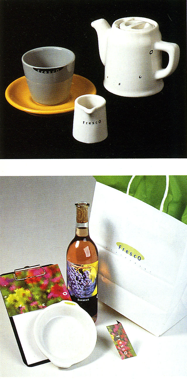
Wine label, dinnerware, stationary items, matches, dessert menu, and tea service for Fresco Restaurant, 1996.
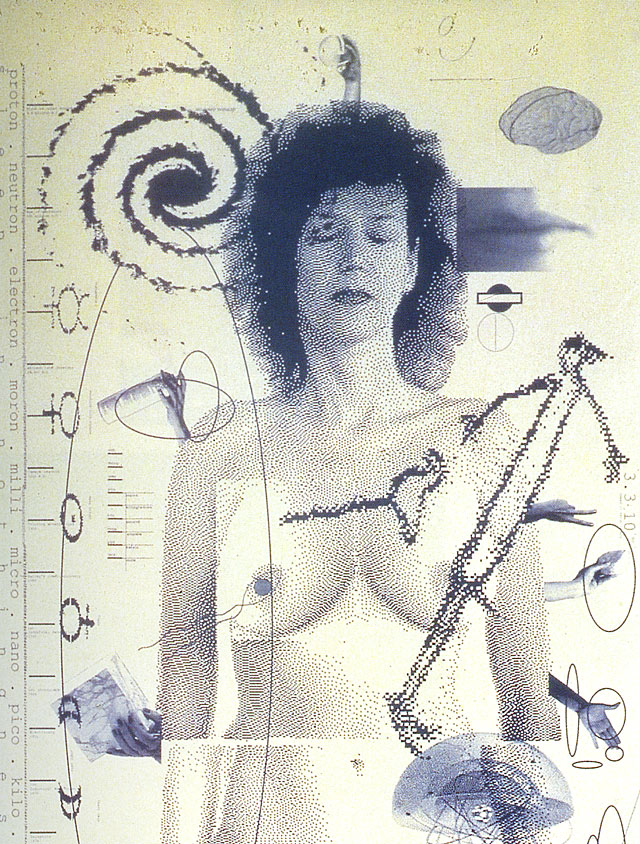
Design Quarterly 133, Does It Make Sense? (detail), Walker Art Center, Minneapolis, 1989.
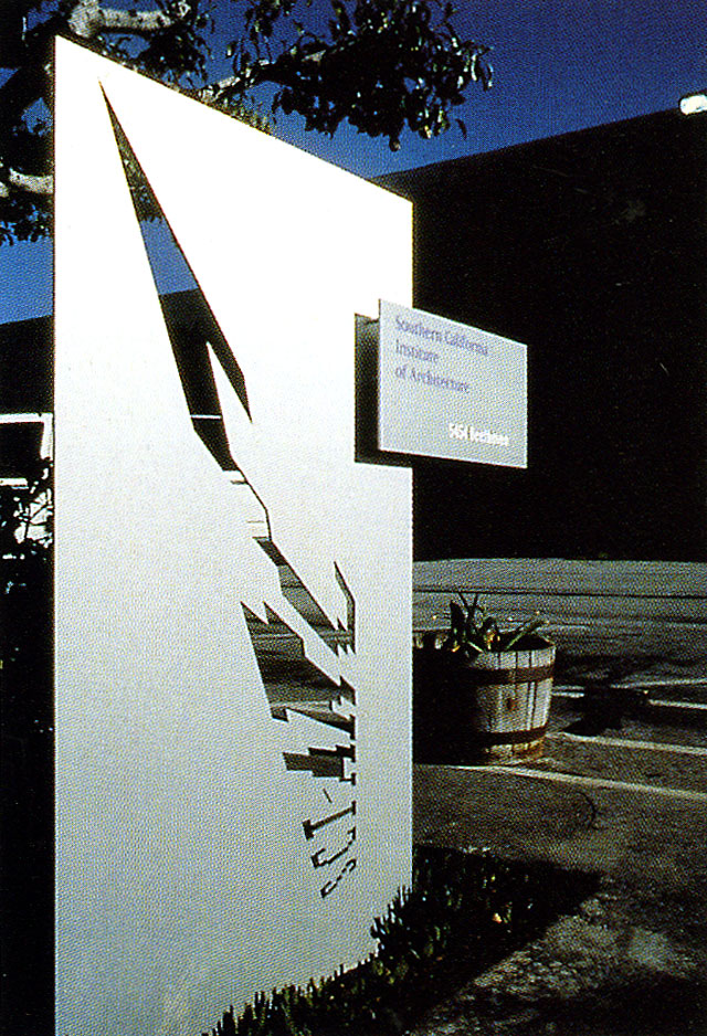
Exterior signage, Southern California Institute of Architecture, 1993.
A professional dancer with the Fred Astaire Dance School in New York City, Renee Greiman performed on television and taught classes, often enlisting the young April as a dance partner. As a result, April relates, she still knows how to do the cha-cha, mambo, waltz, tango, merengue, fox trot, rumba, and limbo. But perhaps her most important lesson from her mother came from her often-repeated saying, “April, you can't fake the cha-cha.” From an early age, Greiman learned that integrity and immersion were critical elements in one's art.
Her formal design education began shortly after she settled on the idea of going to art school and applied to Rhode Island School of Design. Though she failed miserably on the part of the application that required her to draw a pair of old boots, the dean of admissions pointed out that her portfolio was very strong in graphics and suggested that she apply to the graphic design program at Kansas City Art Institute. Having no idea how one might define graphic design or what it meant, she nonetheless took his suggestion and was accepted into the program.
At KCAI, Greiman was introduced to the principles of Modernism by Inge Druckrey, Hans Allemann, and Chris Zelinsky, all of whom had been educated at the Basel School of Design in Switzerland. Inspired by this experience, she went to Basel for graduate school. As a student of Armin Hoffman and Wolfgang Weingart in the early 1970s, Greiman explored the International Style in depth, as well as Weingart's personal experiments in developing an aesthetic that was less reflective of the Modernist heritage and more representative of a changing, post-industrial society. Weingart introduced his students to what is now called the New Wave, a more intuitive, eclectic departure from the stark organization and neutral objectivity of the grid that sent shock waves through the design community. Wide letterspacing, changing type weights or styles within a single word, and the use of type set on an angle were explored, not as mere stylistic indulgences but in an effort to expand typographic communication more meaningfully. Within a decade, the impact of Weingart and the students who studied with him was evident everywhere: the aesthetic had been widely co-opted and imitated, with the original intent long forgotten or known to only a few.
Greiman was one of those who remembered. In her work, she continued to explore typographic meaning and began experimenting with ways to alter the two-dimensional space of the page and reimagine it as a more three- and four-dimensional continuum of time and space. In her first job after moving to Los Angeles, Greiman hired Jayme Odgers, who had previously worked as an assistant to Paul Rand, to shoot a series of photographs. This collaboration with Odgers would lead to two experiences that would greatly influence the direction that her life would take—he introduced her to the desert, a journey that would forever influence her way of thinking and being; and shortly after, they formed a creative partnership that was to last for four years and produce some highly visible work. Notable projects include a 1979 poster for California Institute of the Arts that Odgers art directed and photographed, the 1980 China Club Restaurant and Lounge advertisements, and a poster, designed in 1982, for the 1984 Olympics.
When CalArts invited her to direct its graphic design program in 1982, she committed herself to exploring design education and also gained access to state-of-the-art video and digitizing equipment. She immersed herself in being an educator as well as in the new media, spending her spare time traversing the digital terrain in a quest for image-making potential. She began using video and analogue computers to hybridize, combining different elements through the new media. Greiman knew intuitively that the field of graphic design was rapidly changing and that emerging technologies would soon be integrated into everyday design practice. In 1984 she lobbied successfully to change the department name to Visual Communications, feeling that the term “graphic design” would prove too limiting to future designers. Later that year, with her business booming, she decided to switch gears and become a student rather than an educator, to study the effect of technology on her own work. She returned to full-time practice and acquired her first Macintosh.
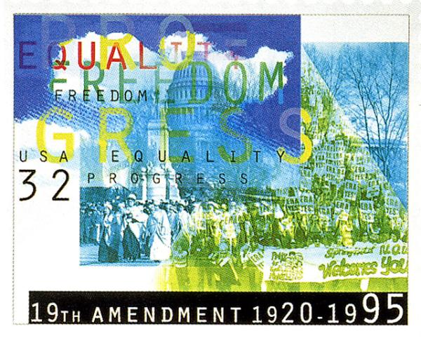
U.S. postage stamp commemorating the Nineteenth Amendment.
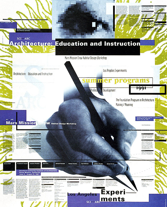
Summer programs poster for Southern California Institute of Architecture, 1991.
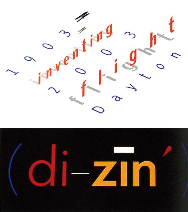
(top) Logo for Inventing Flight, a centennial celebration that will coincide with the Ohio Bicentennial; (bottom) Di-zin logotype, 1984.
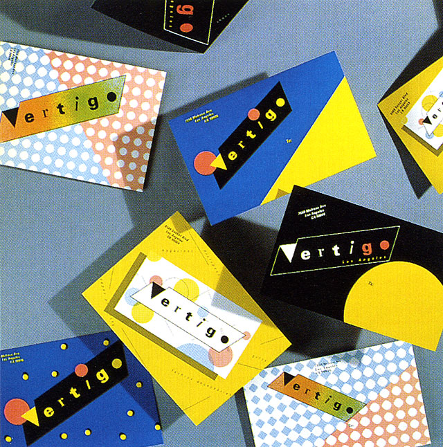
Identity, business cards, hang tags, and postcards for Vertigo, 1979.
Also in 1984, Greiman also completed a poster for Ron Rezek titled “Iris Light” that was significant for its innovative use of video imagery and integration of New Wave typography with classical design elements. This work incorporated a still video image at a time when this meant shooting a traditional photograph off the monitor using a 35mm camera. “Iris Light” represented a turning point in Greiman's work: it is the first hybrid piece incorporating digital technology that Greiman felt was conceptually and aesthetically successful. Of the video image, she says, “Instead of looking like a bad photograph, the image was gestural. It looked like a painting; it captured the spirit of light.” In this case, the video technology integrated with the concept of light: light from the video screen combined with light from the lamp resulted in an image wherein the form matched the content.
Greiman's California New Wave typography and mixed-media design had been rocking the Modernist boat for a few years when she undertook a major assault upon the design community's sensibilities and preconceptions of what constitutes design in 1986, in an issue of Design Quarterly. Published by the Walker Art Center, edited by Mildred Friedman, and directed toward an intermational design audience, each issue of Design Quarterly focused on a specific theme. Greiman was not only the focus of issue #133, she was invited to design it and show her own work.
Greiman saw Design Quarterly #133 as an opportunity not only to present her digital work but to ask a larger question of the work and the medium: Does it make sense? Reading Wittgenstein on the topic, she identified with his conclusion: “It makes sense if you give it sense.” She says, “I love this notion which exists in physics as well—that the observer is the observed, and the observed is the observer. The tools and technologies begin to dictate what and how you see something, or how the outcome is predictable. These ideas bring back the kid in me, that very pure curiosity.” Greiman's piece challenged existing notions of what a magazine should be. Rather than the standard thirty-two-page sequence, she reformatted the piece as a poster that folded out to almost three by six feet. On the front is an image of Greiman's digitized, naked body amid layers of interacting images and text. On the back, colorful atmospheric spatial video images are interspersed with thoughtful comments and painstaking notations on the digital process—a virtual landscape of text and image. Beyond considering whether digital technologies made sense, the Design Quarterly poster seemed to embody the disillusionment of a nation deeply wounded by the Vietnam war and shaped by the growth of feminism, spiritualism, Eastern religion, Jungian archetypes, and dream symbolism. “Does It Make Sense?” was also an astounding technical feat. The process of integrating digitized video images and bitmapped type was not unlike pulling teeth in the early days of Macintosh and MacDraw. The files were so large, and the equipment so slow that she would send the file to print when she left the studio in the evening and it would just be finished when she returned in the morning. One morning, after she had arrived and was assembling the tiled image, it was clear that something big was missing. For some reason, her body had not printed, though everything else was there. While the technical details of the mystery of the missing body remained unsolved, its later reappearance on the pages presented another problem—Greiman didn't like the way her right breast looked. The reproduction process had flattened her and the light was strange. So, in what may well be the first MacDraw breast replacement; she cloned and flopped her left breast and placed it on the right side of her body.
Before the appearance of “Does It Make Sense?” designers widely considered bit-mapped type and imagery not only unorthodox but unacceptable, straying too far from the clean, crisp precision of the Intermational Style. The computer itself was viewed as cold and unfriendly, wildly expensive, and a harbinger of the demise of fine design. After the publication of Design Quarterly #133, many designers felt compelled to reconsider the role of the computer in design practice. Greiman's willingness to ask the question, and to place it at the center of the design community, triggered countless debates about computers, context, and creativity.
Greiman warmly recalls receiving a phone call from Massimo Vignelli soon after he saw the poster. “I have just one question,” he said. “When do I get the other side?” A Modernist's query? Perhaps, but more clearly an indicator of the departure Greiman had made from the coolly classical to the intensely personal, poetic, and digital, and in particular of the giant step that she had boldly taken into what had been very much a man's world.
Greiman sees herself as a natural bridge between the Modernist tradition and future generations of designers. Given her classical education at KCAI and graduate studies with Hoffman and Weingart at Basel, she possesses the knowledge and skills of the Modernist tradition. And yet she is a vocal advocate of the new aesthetic, defending both the visual and conceptual aesthetics, as well as new technologies, to skeptics. “In the tradition of graphic design in the twentieth century, you had to be either a great typographer, a great designer/illustrator, or a great poster designer. Now we are confronted with motion graphics, the World Wide Web, and interactive applications. The world has changed and the field is changing to meet it.” Greiman is adamant that we must be open to new paradigms, to new metaphors, to a whole new spirit of design: “It's not just graphic design anymore. We just don't have a new name for it yet.”
New paradigms emerge in Greiman's own studio including what may be a new model of the contemporary design studio, reflective of cultural shifts. Greiman acts as both a generalist and a specialist. “I don't hire graphic designers anymore. The idea of many designers working in virtual isolation is no longer relevant. I hire collaborators who are specialists in their own fields—a web master, a researcher, a production artist—depending on the project.” As a generalist, she is involved in all phases of the projects. As a specialist, the concept and design are ultimately her own. In this new studio structure, each collaborator is an expert in his or her field, with Greiman as the tie that binds. In order to expand her research into new technologies and image generation, Greiman created Greimanski Labs as a conceptual offshoot of her studio. She describes the laboratory as a place for research and exploration in the development of non-commercial images and projects. Regardless of client, the lab works in a variety of media ranging from traditional photography to new tools and technologies.
One of the original Flying Greimans speaks with great enthusiasm of her newest large-scale project, “Inventing Flight,” originally titled “A Century of Flight.” Greiman worked with a team of experts to develop an active approach to the concept instead of fixing the notion of flight in the past. For the event—a celebration of 100 years of flying to take place in Dayton, Ohio, in 2003—Greiman and her team are developing a total identity—motion graphics, website, collateral materials, exhibitions, and an interactive installation. Greiman has taken her passion for science and technology and immersed herself in every detail of the history of flight. The celebratory event is particularly significant to her because it addresses the early stages of bringing information into space and the information revolution. “I love it when things come full circle like this,” she says. “Everything is related, and makes this wonderful loop of interconnection.”
Further expanding the very broad scope of her work, Greiman often collaborates with architects on spaces and environments, with most of her contribution in the areas of color, finishes, and materials. She sees these three- and four-dimensional collaborations as yet another aspect of hybridizing, in which she considers ideas of integration of building and landscape, interior and exterior, inner and outer selves. Miracle Manor, a business and creative collaboration with architect Michael Rotondi, is an ideal forum for such explorations.
Greiman sees the site as an opportunity to explore her own personal interests in color, myth, symbolism, and space in real time. “The entire place is sort of a laboratory,” she notes, and one begins to realize that for Greiman, everything is a laboratory. From her investigations at the leading edge of the California New Wave to her pioneering work in digital media and hybrid processes, Greiman sets an example for future generations of designers to be willing to ask the questions that need to be asked.
Copyright 1998 by The American Institute of Graphic Arts.