Recognition
1993 AIGA Medal
Born
1931, Los Angeles
Deceased
2012, New York
By Veronique Vienne
September 9, 1993
A Fearless Dedication to Content
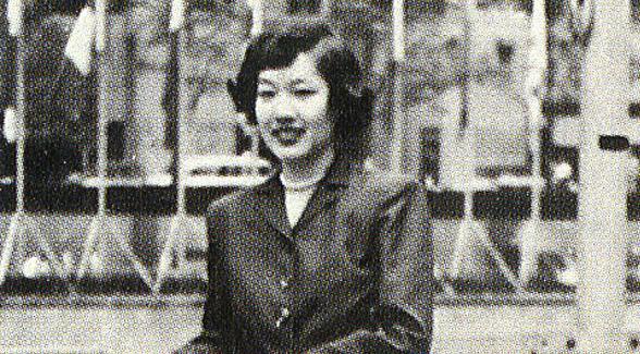
Tomoko Miho is the design world's best-kept secret. A distinctive presence—but a very private person—she has avoided the spotlight. She does not need it, for her designs, endowed with a crystalline clarity, have a luster all their own. She never attempted to make a name for herself, but she has acquired a formidable reputation among her peers: “A minimalist and a Modernist—in the best sense of the term” (George Tscherny). “One of the most perceptive problem-solvers I know” (Rudolph de Harak). “A master of the dramatic understatement” (John Massey).
Reserved and quietly elegant, she is a consensus-builder par excellence. When looking back at her career, everyone agrees that her work is an example of the whole being greater than the sum of its parts. Her contribution to graphic design is far greater than the sum of her talents. Her posters, books, catalogs, logos, showrooms and architectural signage share a common denominator—an internal breadth that comes from the exacting relationship between space and substance, between imagery and information, between concept and details. There is never any sentimentality in her work, yet it elicits a strong emotional response—the gratitude on feels when someone gets it right.
The boldness of her design solutions is not the result of a stylistic choice, but of a fearless dedication to content. Tomoko's unflinching commitment to quality is simply daunting.
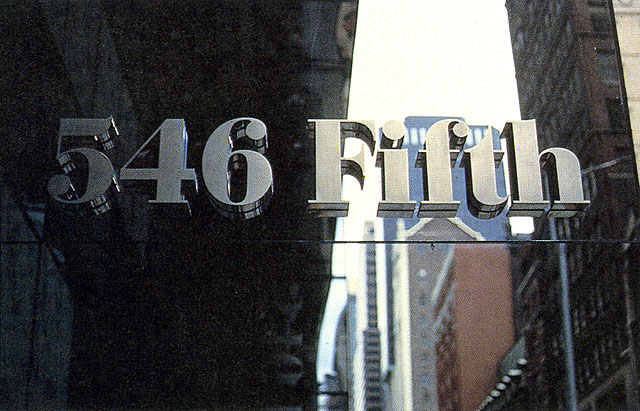
Architectural signage for the building at 546 Fifth Avenue, New York, 1990.
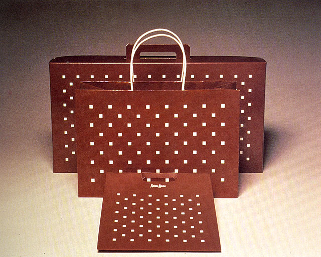
Packaging designs for Neiman Marcus, 1972. Design firm: CARD, New York.
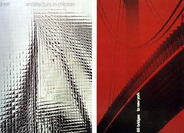
(left) Great Architecture in Chicago poster, 1967. Design firm: CARD, Chicago. Photographer: Rodney Galarneau. (right) 65 Bridges to New York poster, 1967. Photographer: Harvey Lloyd.
One of her gifts is to find potential greatness where others merely see constraints. Born in Los Angeles, Tomoko Kawakami spent part of her early years with her family in an Arizona internment camp. “In order to recover, we had to excel,” she ways. “The experience forced many Japanese-Americans to seek new horizons.” Her new horizons would be defined by fortuitous design opportunities. A summer scholarship from the Minneapolis School of Art (now the Minneapolis College of Art and Design) opened a realm of possibilities. A visit to the Museum of Modern Art during her first trip to Manhattan after high school helped her focus her professional ambition. But it was a full scholarship from the Art Center School in Los Angeles (now the Art Center College of Design in Pasadena) that would truly challenge her sense of aesthetics and broaden her field of vision.
With a degree in industrial design from the Art Center School, she moved first to Philadelphia to join her husband, James Miho, and later to Michigan, where she was hired as a packaging designer by Harley Earl Associates Inc. In the early sixties, a lengthy six-month tour of Europe with Jim and another couple, also designers educated at the Art Center, gave her a chance to reevaluate—and consolidate—all her previous design assumptions.
She remembers her exhilaration when she encountered the European artists—painters, sculptors, craftsmen, typographers—who shared a same keen spirit of experimentation. The international typographic style championed by Swiss graphic designers was not an isolated phenomenon, but an expression of a new concern for the relationship between form and content. This integrated design vision was soon to change the way corporate America viewed itself. Complex identity programs, incorporating various disciplines, would help big companies develop their design philosophy and with it their sense of mission. Europe in the early sixties was seething with an objectifying fervor born form a need to find a consensus after the war. The Swiss graphic approach—multicultural yet rational and neutral—offered everyone an opportunity to start all over again. New sans serif typefaces came to epitomize a burgeoning non-partisan international democratic spirit. Seen as a universal expression of an open class-free rationalism, this simplified European design style was instantly assimilated into the American culture. “To get a design award in those days,” recalls Martin Pedersen with a chuckle, “all you had to do was use Helvetica.”
The description of Tomoko and Jim's European tour reads like a designer's epic poem. In Milan, they met Olivetti art director Giovanni Pintori; near Lausanne, Switzerland, they visited painter and sculptor Hans Erni; in Basel they spent time with poser artist and designer Herbert Leupin; in Germany they toured Hochschule für Gestaltung—the famed Ulm design school—and made contact with graphic designer Tomás Gonda; in Finland they were introduced to Armi Ratia, creator of the Marimekko image, and to industrial designer Tapio Wirkkala. By the end of this trip, Tomoko understood what would be her mandate—to “join space and substance,” as she later wrote. To draw the big picture, its message and its context—to be a graphic designer.
Tomoko and Jim toured Europe in their new silver Porsche, creating quite a stir in small villages. They were the future—a new generation of inquisitive, upbeat, and energetic design professionals. During their marriage, a creative partnership that lasted two decades, the Mihos retained their distinctive individuality. He, charming and charismatic; she, quiet and observant. They shared the same passion for graphic excellence—and sometimes even the same clients—but always kept their respective points of view and independence intact.
Tomoko's impenetrable demeanor conceals an innate ability to confront unfamiliar situations, absorb new information, and integrate jarring contradictions. She sees order in clutter; she enjoys translating abstract concepts in clear visual terms. As a result, her design solutions have an unassuming, effortless, and lucid quality.
Her serene way with problem-solving made her, right from the start, an ideal team player. After her European tour, she joined George Nelson and Co. Inc., in New York City, as a graphic designer. Irving Harper, a renaissance man—architect, furniture and industrial designer, exhibit and graphic designer and advertising maverick—who acted as creative director for the Nelson office, became an early influence. When he left to start his own design firm, she was named head of the graphic design department. “Perfection was Tomoko's very own mandate,” Harper remembers. “Her work was remarkably clean, beautiful pristine.” Tomoko's first major challenge was to handle the graphics portion of George Nelson's main account, Herman Miller. It turned out to be the match of a lifetime. For twelve years, the innovative Michigan-based office furniture company would be almost a constant in Tomoko's work—and an important outlet for her creative inspiration.
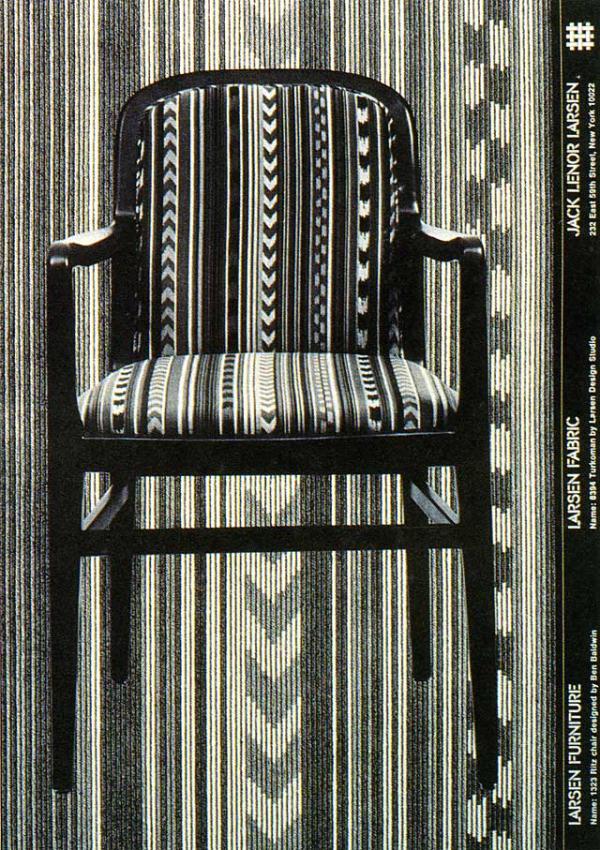
Advertisement for Jack Lenor Larsen furniture and fabrics, 1977.
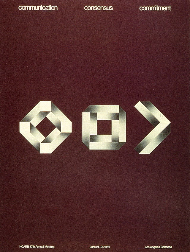
Communication, Consensus, Commitment poster for annual meeting of the National Council of Architectural Registration Boards, 1978.
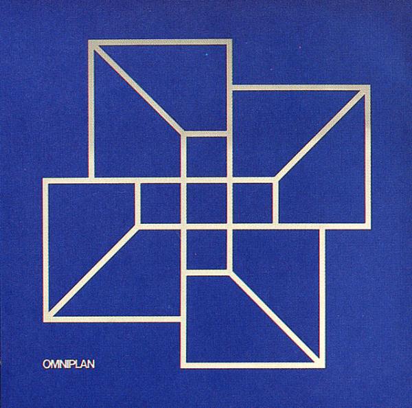
Poster to introduce new name and symbol for Omniplan Architects, Dallas, 1971.
Thomas Miller, Detail from the DuSable mosaics, 1995. DuSable Museum of African American History, Chicago. Photograph: Chris Dingwall.
During the late sixties and the early seventies, Tomoko worked on various Herman Miller projects—but this time with John Massey, a consummate designer, painter and communicator. Director of advertising, design and public relations at Container Corporation of America, Massey was also director of the Center for Advanced Research in Design (CARD), a design office that functioned as a CCA subsidiary and profit center. CARD developed design and communications programs for organizations in the private and public sectors. The clients included Atlantic Richfield Company, Herman Miller Inc.—and its own parent company, Container Corporation of America.
Tomoko worked for a couple of years in the CARD Chicago office before going to New York to open a branch to serve CARD's East Coast clients. During that time—for about eight years—she was handling a flow of Herman Miller print and communications material.
In the eighties, as principal of Tomoko Miho Co., she reestablished contact with Herman Miller, this time creating environmental art and display for the New York, IDC/NY Long Island and Los Angeles showrooms, as well as special invitations and a poster.
To explain her particular sense of space, Tomoko alludes to shakkei, a traditional Japanese garden design discipline that integrates the background with the foreground, bringing distant views into clear focus. Meaning “borrowing scenery,” shakkei transforms the experience of space, imparting a sense of depth, width, and breadth to a small environment.
Tomoko Miho carefully gardens every inch of graphic space. She often borrows spatial conventions from the three-dimensional world, making the two-dimensional plane appear larger, deeper, more inclusive. For her, the page is not an opaque screen, but a threshold. Her designs invite viewers to cross over into a multilayered world.
To create a sense of spaciousness, she sometimes punctures hole through her design. A poster for Container Corporation of America, announcing the opening of the Great Ideas of Western Man exhibition at the New York Cultural Center, has a die-cut window with a diagonal flap revealing a section of a Herbert Bayer composition illustrating the Wittgenstein quote “The limits of my language mean the limits of my world.” For Tomoko, though, the limit of the graphic design language does not mean the limit of her imagination.
To expand space, she also borrows from the laws of perspective. For Omniplan, a Dallas-based architectural firm, she designed a logo that tricks the eye, and looks either concave or convex. Four interlocking schematic squares, arranged in a cross pattern, suggest the firm's multidisciplinary capabilities. Working in collaboration with designer James Sebastian, she decided to push the limits of the logo's graphic identity as far as possible. A concept as well as a logotype, the Omniplan emblem lent itself to multiple interpretations—as a paperweight, a die-cut Christmas card and a mirrored sculpture for the lobby.
Like the surrealists, Tomoko plays with trompe l'oeil illusions. A wall chart for Champion Papers, showing a wide range of envelope sizes and shapes, integrated a real envelope among the fake ones.
For a series of posters on architecture in New York and Chicago—now in the permanent collection of the Museum of Modern Art—she captured the urban scale by showing partially obscured buildings: the fractured reflection of a skyscraper of the monochromatic outline of a bridge in fog. As modern today as they were in 1967, these posters are timeless examples of Tomoko's masterful sense of composition and pictorial ingenuity.
A direct application of the shakkei principle is a three-layer translucent poster for the Herman Miller “Ethospace” office system. Wafer-thin sheets of tracing vellum, fastened by an eyelet, rotate to create new and unexpected layouts and vistas. Like the Ethospace tile system designed to open up the office worker's field of vision, Tomoko's conceptual poster opens up the viewer's spatial perceptions.
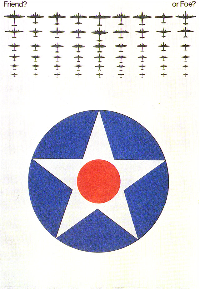
Tomoko's signature is her exquisite sense of scale. A series of posters for the National Air and Space Museum, designed in partnership with Jim Miho when they were principals of Miho Inc., demonstrates how easy it is for skilled graphic designers to transform a plain piece of paper into a boundless patch of sky. The “Friend? Or Foe?” poster contrasts a huge Air Force symbol in the foreground with a fleet of tiny World War II fighter planes silhouetted at the top. The clever juxtaposition emphasizes the helplessness of the pilot—stuck, like the symbol, in the middle—faced with a swarm of almost unidentifiable aircraft. But what really captures the imagination is the way the type helps create a sense of urgency. Captions identifying the planes are arranged in short columns at the bottom, suggesting a low horizon line. To decipher this information, one must hunker down. An ominous emptiness looms above the reader's eyes.
Another poser, “Pioneers of Flight,” features eighty famous pilots and notable aeronautics figures. A narrow vertical grid creates a checkerboard effect. Miniature portraits are laid out in diagonal, forming ascending zigzagging rows. But here again, the fascination one feels when looking at the poster comes from the scale of negative versus positive space, arranged to generate a strong graphic updraft that simulates flight.
For Tomoko, scale is not simply a question of contrast a relationships, but also a concern for detail. Small elements, not large ones, create a sense of hierarchy; short captions, set in small type, make a picture seem majestic; a twelve-foot-long architectural sign, dwarfed by a glass-and-steel tower, lends magnitude to an entrance; and invisible grid congers authority to an uncluttered layout. “Tomoko gives as much thought to a personal letterhead as to a major corporate project,” notes Martin Pedersen. Tomoko Miho's broad yet thorough vision is an invaluable asset to the design community. The quality she brings to her discipline benefits everyone. First, her clients—the list includes Herman Miller Inc., but also Champion International Corporation; Omniplan Architects; Mellmuth, Obata & Kassabaum Inc. Architects; the Museum of Modern Art, New York; the National Endowment for the Arts; the Isamu Noguchi Foundation, Inc.; Neiman Marcus; and Jack Lenor Larsen Inc., to name a few.
Her work also benefits us, her colleagues. It reminds us that modernity is not a trend, not a style, not even an attitude. It is a lifelong pursuit to remain curious, lucid, relevant.
Last, but not least, her work benefits the people who use the posters, brochures, books, invitations, and architectural signage she designs. They enter with her into a harmonious relationship with the information presented to them, its form and its content. “It is that harmony that creates the ringing clarity of statement that we sense as an experience,” she writes, “as a meaningful whole, as a oneness-as good design.”
Copyright 1994 by The American Institute of Graphic Arts.
Keep in Touch with AIGA
Sign up for email communications to be the first for updates on webinars, events, programs, and announcements.