Recognition
2018 AIGA Medal
Born
1971, Canoga Park, California
By Debbie Millman
March 20, 2018
Follow Us
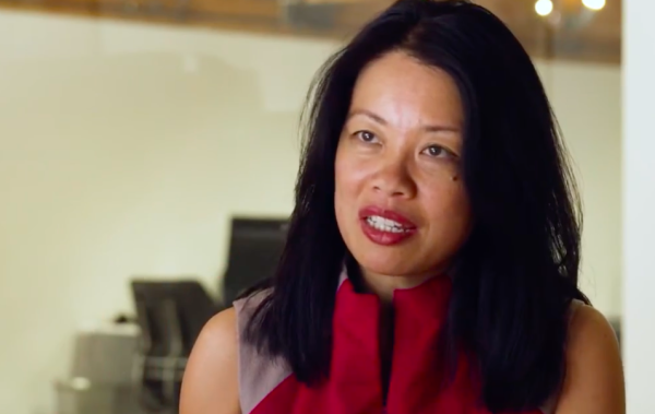
Recognized for her groundbreaking work and mastery in the field of visual storytelling as a motion graphics designer and director for more than twenty years at Imaginary Forces
Film and television title sequences must be myriad things at once: Thrilling yet subtle. Familiar yet distinct. Evocative of the project they precede, yet able to stand on their own. They must thrive in a lifespan measured in seconds and milliseconds, versus the luxury of minutes. Yet Karin Fong has managed to weave entire microworlds into these moments for viewers of Boardwalk Empire, South Park, Black Sails, as well as players of God of War video games.
“Opening titles are an invitation. Good ones stir feelings of anticipation, making it easy for the viewer to join in,” Fong says. “The title sequence becomes a passageway into the show. It says, ‘Pay attention, now—you are leaving your everyday life behind.’ It’s the curtain that rises up, telling you to suspend your disbelief. It’s the ‘Once upon a time…’ that signifies a story is about to unfold.”
As a child, Fong excelled at drawing, and adored books. In high school, her talent for combining her artistic and storytelling skills became clear. For one memorable history class assignment, she decided to create a stop-motion film instead of simply penning a paper.
She continued on to major in art at Yale, where design captured her interests. “I fell in love with graphic design because of the way it combines text and image,” she said in the book Design for Motion. “There’s a real opportunity for narrative and storytelling.” For her senior project, she created an animated alphabet, and it caught the attention of the team at Where in the World is Carmen Sandiego?; she joined the staff as an animator. Then, in 1996, she worked alongside the team’s title-design guru, Kyle Cooper, to create the studio Imaginary Forces.
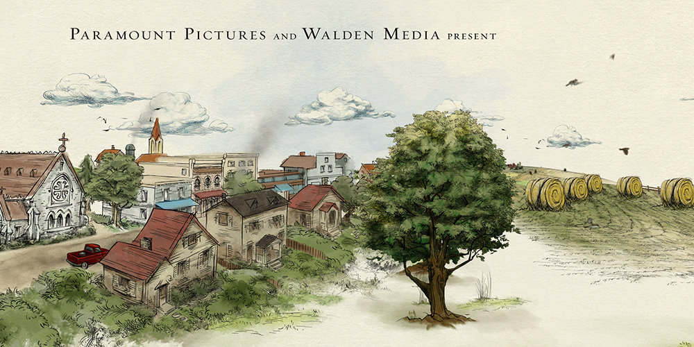
Still from Charlotte’s Web main title, courtesy of Imaginary Forces.
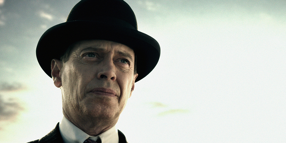
Still from Boardwalk Empire main title, courtesy of Imaginary Forces.

Still from STARZ Counterpart main title, courtesy of Imaginary Forces.
Capturing so much in such a short time is an artform that requires a delicate balancing act to avoid the pitfall of overdesigning. Fong says she knows a piece of design is complete when she has gone too far, and then has to come back.
In the case of the titles for Charlotte’s Web, the initial direction the team pursued was obvious, almost obligatory: Given that the movie is about a spider that sends messages via webs, they set the type in spider webs. But the director didn’t like it, and Fong soon came around to his way of thinking. As she explains, “The moment it’s revealed that Charlotte has been spinning words is a key dramatic point in the story. Did we really want to waste the power of that image in the opening? Better to save it for its proper place in the narrative. For similar reasons, we chose not to introduce any of the animal characters in the beginning, saving them for their entrances in the plot.” Instead, she crafted a set of titles featuring the farm in the watercolor style of Garth Williams’ artwork for the original book—perhaps a fitting solution for a designer who first thought she would go into a career in children’s book publishing.
In other cases, Fong won’t sidestep a plot giveaway so much as tease audiences with Easter eggs and metaphors. Consider the opening titles of HBO’s Boardwalk Empire, which earned her an Emmy nomination. At first, she and her team considered a detailed montage of the series’ sets and costumes—after all, there was a visual wonderland to work with, considering the show’s Prohibition-era Atlantic City setting. But HBO wanted her to go a level deeper.
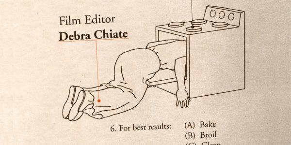
Still from Dead Man on Campus main title, courtesy of Imaginary Forces.
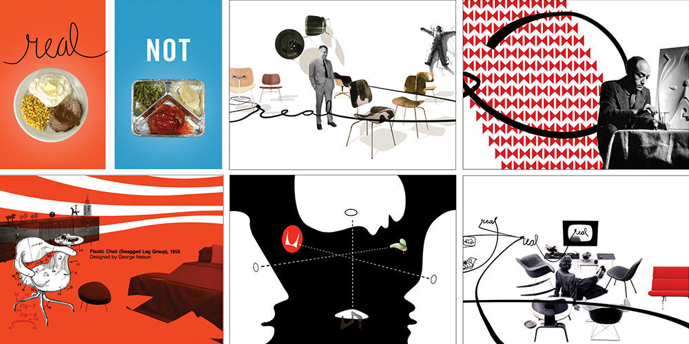
Stills from Herman Miller’s “Get Real” television commercial, courtesy of Imaginary Forces.
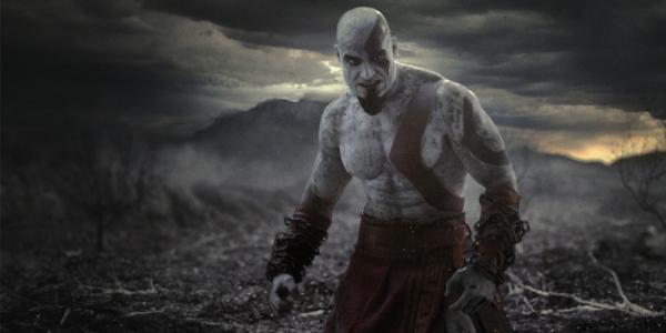
Still from God of War trailer, courtesy of Imaginary Forces.

Still from Target’s “Keeps Gettin’ Better” television commercial, courtesy of Imaginary Forces.
“I love when a title sequence provokes more questions than answers,” Fong admits. “Maybe it doesn’t make complete sense until you get to a certain point.… Maybe the viewer needs a couple of seasons to understand what happens in the title sequence.”
Fong maintains that one of her favorite parts of the title-design process is the research phase. She takes a deep dive, immersing herself in the world; if she’s working on a period piece, she’ll listen to the music of the era, study the clothes, absorb the politics of the day. She describes her workspace as a mess consisting of props, books, walls full of storyboards that she moves around as needed for sequence. Over the years she has come to appreciate the value of working within a team of intensely talented people, and bucks the notion of the lone high-brow artist who shuts herself off from the skills and contributions of others.
For Terminator Salvation, the director, McG, wanted to call back to the classic monolithic letters of the original 1984 title sequence. Fong’s team went into research mode to reinvent the letters in a way that could reflect the new direction of the story. Fong ended up with developed, worn metallic textures—a reference to the post-apocalyptic setting of the film—on blocks of text that weave in and out, akin to the virtual essence of the original.
While Fong has made remarkable contributions to the world of film and television titles, to focus solely on them is to overlook the rest of her varied output—the sum total of which earned her a spot on Fast Company’s Most Creative People in Business list. She has created advertising spots for the likes of Target and Herman Miller; she has built amazing installations for locations such as the Wynn Las Vegas; and she has even dabbled in the world of video games with her work on the God of War series.
The game’s director was looking for cinematic flashbacks scattered throughout the quest that would be visually distinct from the rest of the gameplay, so players would be clear about what was past and what was present. He had seen Imaginary Forces’ animated titles for The Mummy: Tomb of the Dragon Emperor, which employed Chinese brush painting. Tasked with the new medium, Fong turned to an ancient source for inspiration—specifically, Greek pottery—and made it feel as if it had come to life.
“It’s our job to give the player a wormhole into an alternate reality, and that’s really why we do the work that we do,” Fong says. “Whether for a game or a film, we’re always looking to create a portal into the world of the story.”
Brick by brick, Karin Fong has built a vast foundation, upon which she now stands at the forefront of the industry. And as anyone who has been led into a story by her knows, we’re better off for it, no matter the many incredible ways she pulls it off.
As she said in an interview with CreativeFuture, “It really is about the devil being in the details. You just labor over these things. You have such a finite amount of time. It’s work akin to poetry. Every little word counts.”
Resources
“20Q: Karin Fong.” DesignIndaba. Last modified April 5, 2011. http://www.designindaba.com/articles/interviews/20q-karin-fong/
Blankenship, Mark. “You Are Now Exiting the Real World.” Yale Alumni Magazine, November/December 2011.
Fong, Karin. “Title Designer Karin Fong Reveals the Secrets Behind Good Opening Credits.” Tribeca, August 15, 2013.
“Karin Fong.” Television Academy. Accessed March 2, 2018. https://www.emmys.com/bios/karin-fong/
“The Most Creative People in Business 2009.” Fast Company. Accessed March 3, 2018. https://www.fastcompany.com/most-creative-people/2009/
Pash (Matthew Pashkow). Inspirability: 40 Top Designers Speak Out About What Inspires. Cincinnati: HOW Design Books, 2005.
Robischon, Noah. “How to Create a ‘Godly’ Game Opening.” Fast Company, June 20, 2010.
Shaw, Austin. Design for Motion: Fundamentals and Techniques of Motion Design. New York: Focal Press, 2016.
Streib, Lauren. “Director Karin Fong on Finding Her ‘Aha’ Moments.” Magenta, March 10, 2017.
Tasgal, Anthony. The Storytelling Book: Finding the Golden Thread in Your Presentations. London: LID Publishing, 2015.
Vlaanderen, Remco; Paul de Heer, Niels de Roos, Madelinde Hageman and Raoul Matheron. “Karin Fong Interview.” Filmed August 8, 2009. Video, 5:44. http://www.watchthetitles.com/articles/00145-Karin_Fong_interview/
“What Does a Television Title Designer Do? A Conversation With Karin Fong.” CreativeFuture, Last modified December 13, 2017. https://creativefuture.org/television-title-designer-conversation-karin-fong/
Willis, Holly. “Karin Fong’s Design Journey.”AIGA, September 1, 2008. https://www.aiga.org/design-journeys-karin-fong
Keep in Touch with AIGA
Sign up for email communications to be the first for updates on webinars, events, programs, and announcements.