

Competitions Deadline Extended
The call for entries period for 50 Books | 50 Covers of 2023 and 365: AIGA Year in Design is still open! Submit your masterpieces and let your designs captivate audiences globally. Enter by April 26, 2024.
Learn More and Enter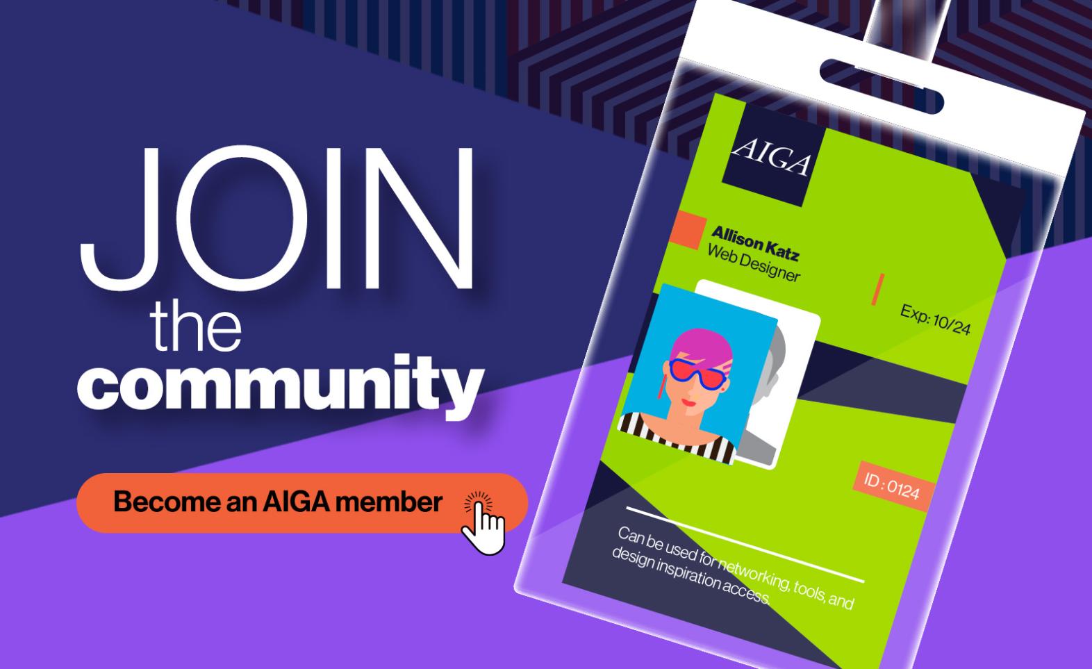

Network, Connect, and Grow in AIGA
AIGA Membership offers a dynamic community through the virtual AIGA Community platform and local events. Network with peers, share insights, and tackle career challenges together while building a professional network to help you excel in your career.
Learn More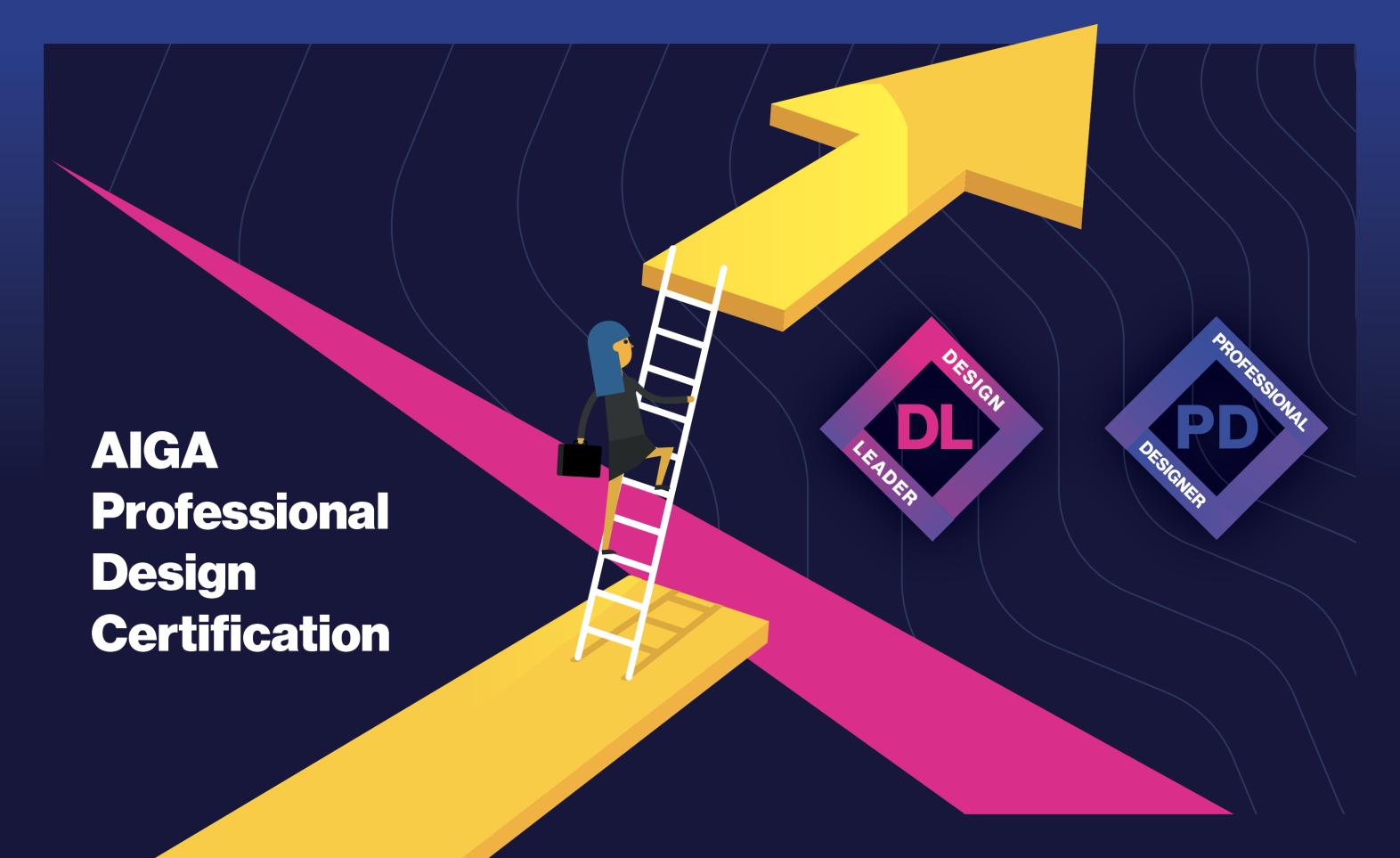

Get Certified!
The AIGA Professional Design Certification represents a commitment to the design profession and to lifelong learning. This new online design certification program is open to design practitioners at every level who are committed to expanding their careers.
Learn More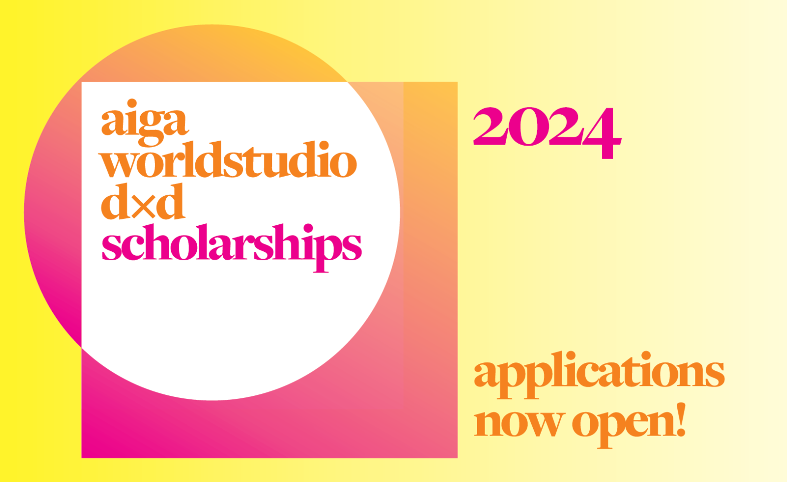

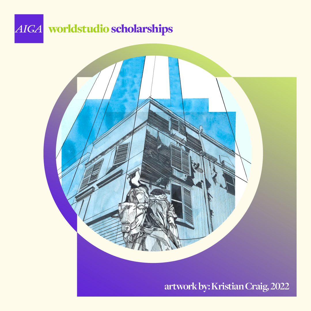
Scholarship Applications Now Open!
The AIGA Worldstudio D×D Scholarships aim to increase diversity in the design profession by creating equitable opportunities for the next generation of creative talent. Open to undergraduate and graduate students across the United States.
Apply NowOur Mission
AIGA advances design as a professional craft, strategic advantage, and vital cultural force.
In The News
Best Book and Cover Designs of 2022 Revealed: Remarkable Winners Announced for AIGA’s 50 Books | 50 Covers Competition
Read MoreExplore AIGA


Events
Meet the Community
View more eventsDec
7
Virtual | 6
AIGA Portland's "WIP - Work in Progress"
An opportunity for designers to give & receive constructive feedback on creative work prior to showing their team/client/stakeholders.
View Details
Apr 27, 2024 | San Francisco
WILD April East Bay Meetup: Kinfolx Oakland
Apr 27, 2024 | Orlando
2024 SPOT Showcase
Apr 28, 2024 | Chicago
Coffee & Crits: April 2024
Apr 28, 2024 | San Francisco
WILD April Meetup: Letterform Archive Exhibit
Being a member of AIGA has given me access to educational resources for my professional development and business opportunities...it's opened the door to meaningful relationships with a diverse group of dedicated people with whom I'm proud to be in community with.
John Hornsby
AIGA Asheville
![[field.undefined]](/sites/default/files/styles/one_fourth_width_320/public/John-Hornsby-1000x000.jpg?itok=jv7CFC6f "John Hornsby Headshot")
AIGA Chapters
Be a part of our local communities


Find Your Local Chapter
Support your local creative community—when you become a member and select a chapter, a portion of your dues goes to funding your chapter’s programming and initiatives.
Find Your Dream Job
Visit AIGA Design Jobs to make your next move. Free access to view and apply for AIGA members.
Empowering Designers to Change the World
Join today to access networking through your local chapter and a wide variety of local and national programs and events.
About AIGA MembershipMore from AIGA
Resources for Everyone
Get the tools you need to succeed in your career. Explore our collection of resources for freelancers, business owners, design educators, students, in-house designers, and other design professions.
Visit the Resource Collection
Curated Collections for Designers
Featured Resources
Join AIGA and Become a Member Today!
Join today to access networking through your local chapter and a wide variety of local and national programs and events.
Become a Member